Examples
Checkbox


Checkbox as buttonRendering a custom Checkbox as a button element in React, while keeping it accessible to screen reader and keyboard users.
Custom CheckboxRendering a visually hidden Checkbox using the VisuallyHidden component to show a custom checkbox presentation in React.


Checkbox groupRendering multiple Checkbox elements in React to form a group of checkboxes. The selected values are stored in an array provided by the CheckboxProvider component.
Combobox
Animated ComboboxAnimating a Combobox using CSS transitions in React. The component waits for the transition to finish before completely hiding the popover.
ComboboxCancelReseting the value of a Combobox with a button rendered next to it using the ComboboxCancel component.
ComboboxDisclosureOpening and closing a Combobox with the help of a button rendered next to it using the ComboboxDisclosure component.
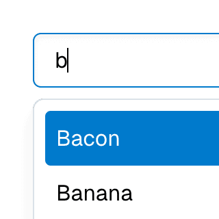
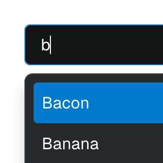
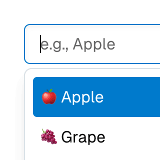
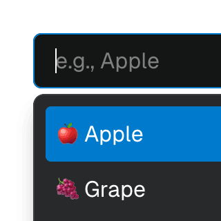
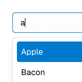
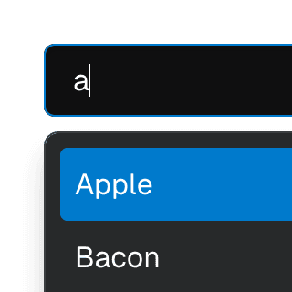
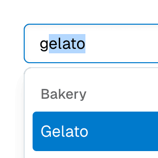
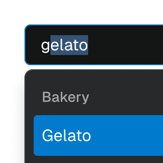
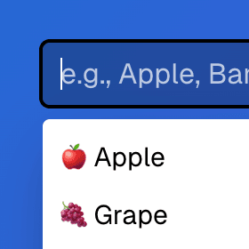
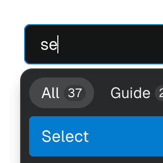
Combobox filteringListing suggestions in a Combobox component based on the input value using React.startTransition to ensure the UI remains responsive during typing.
Combobox with integrated filterFiltering options in a Combobox component through an abstracted implementation using React.useDeferredValue, resulting in a simple higher-level API.
ComboboxGroupOrganizing Combobox items into labelled groups using the ComboboxGroup and ComboboxGroupLabel components in React.

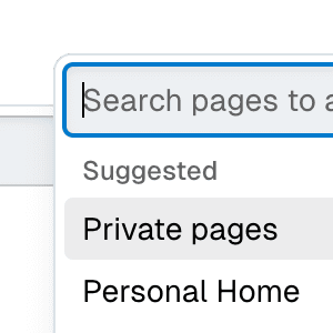
Combobox with linksUsing a Combobox with items rendered as links that can be clicked with keyboard and mouse. This is useful for creating an accessible page search input in React.
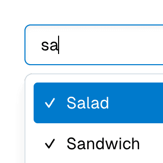
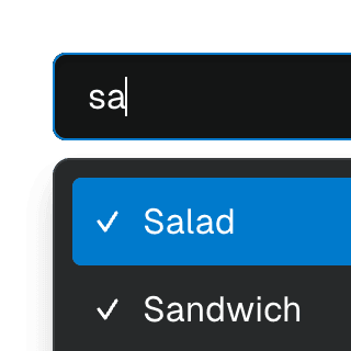
Multi-selectable ComboboxAllowing Combobox to select multiple options by passing an array value to the selectedValue prop.

Radix ComboboxUsing just the necessary Ariakit components to build a Combobox with Radix UI. For projects already using Radix UI and looking for autocomplete, autosuggest and search features.
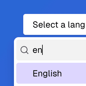

Radix Select with ComboboxRendering a searchable Radix UI Select component with a text field that enables typeahead & autocomplete features using the primitive Ariakit Combobox components.
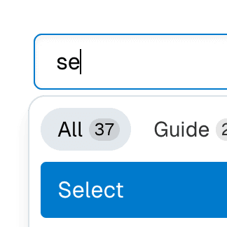
Combobox with TabsOrganizing Combobox with Tab components that support mouse, keyboard, and screen reader interactions. The UI remains responsive by using React.startTransition.
Textarea with inline ComboboxRendering Combobox as a textarea element to create an accessible multiline textbox in React. Inserting specific characters triggers a popup with dynamic suggestions.
Dialog
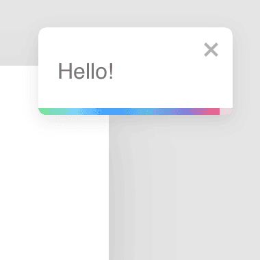
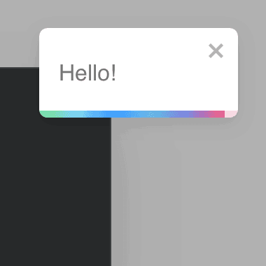
Animated DialogAnimating a modal Dialog and its backdrop element using CSS. The component waits for the transition to finish before completely hiding the dialog or removing it from the React tree.


Dialog with scrollable backdropRendering a modal Dialog component inside a scrollable backdrop container for dialogs that are
taller than the viewport.
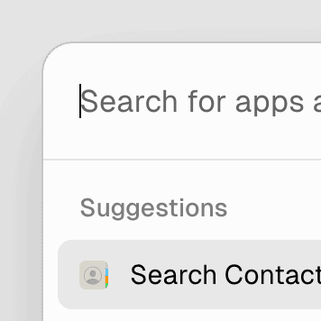
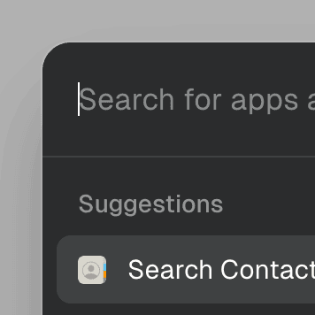
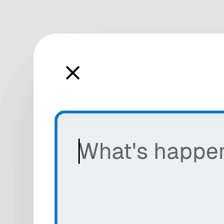
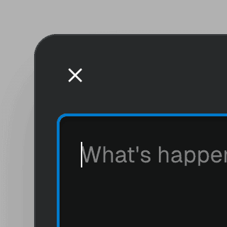
Command MenuCombining Dialog and Combobox to enable users to search a command list in a Raycast-style modal.


Command Menu with TabsCombining Dialog, Tab, and Combobox from Ariakit React to build a command palette component.
Dialog with details & summaryCombining Dialog with the native details element in React so users can interact with it before JavaScript finishes loading.
Dialog with Framer MotionUsing Framer Motion to add initial and exit animations to a modal Dialog and its backdrop element.
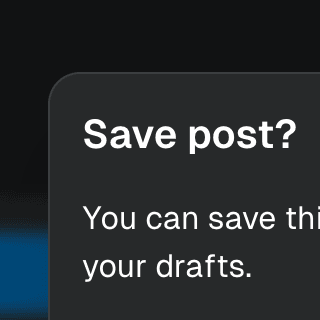
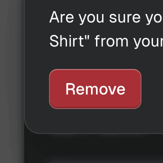
Warning on Dialog hidePreventing users from accidentally closing a modal Dialog component with unsaved changes by displaying a nested confirmation dialog.
Dialog with MenuShowing a nested dropdown Menu component inside a modal Dialog using React.
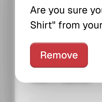
Nested DialogRendering a modal Dialog to confirm an action inside another modal dialog using React.

Radix DialogCreating a modal dialog primitive offering the same API as Radix UI but using the Ariakit Dialog component instead.
Dialog with React RouterUsing React Router to create a modal Dialog that's controlled by the browser history.
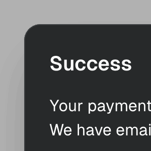
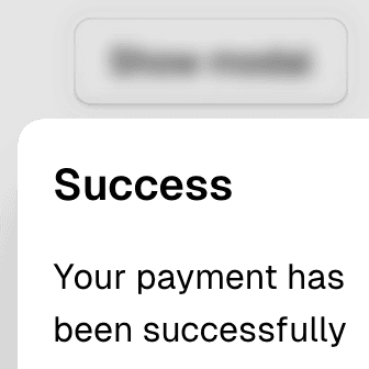
Dialog with React-ToastifyShowing notification toasts using libraries like react-toastify and react-hot-toast while keeping a modal Dialog open with the getPersistentElements prop.
Dialog with Next.js App RouterUsing Next.js Parallel Routes to create an accessible modal Dialog that is rendered on the server and controlled by the URL, with built-in focus management.
Disclosure
Form
FormRadioUsing the FormRadioGroup and FormRadio components to create a Form with custom validation that requires a user to select an option from a list of radio buttons.
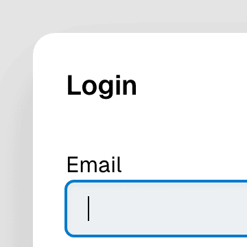
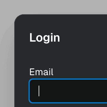
Form with SelectCombining Form and Select to create an accessible custom select widget that works with the browser's built-in validation and native form submission.
Hovercard
Menu
Menu with ComboboxCombining Menu and Combobox to create a dropdown menu with a search field that can be used to filter menu items.
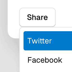
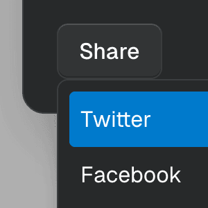
Context menuShowing Menu when right-clicking on an element using the getAnchorRect prop to determine the position of the popover.
Menu with Framer MotionAbstracting Menu into a reusable dropdown menu component that uses Framer Motion to create smooth initial and exit animations.
MenuItemCheckboxRendering a dropdown Menu using the MenuItemCheckbox component with the values and setValues props from MenuProvider to control the checked items.
MenuItemRadioRendering Menu using MenuItemRadio as children and the values prop from MenuProvider to control the checked item.
SubmenuRendering nested Menu components to create a dropdown menu with submenus that open when hovering over the parent menu item.
Submenu with ComboboxNesting Notion-style dropdown menus with search & autocomplete features by combining Menu with Combobox.
Sliding MenuRendering nested Menu components to create submenus that slide in and out using CSS Scroll Snap.
Menu with TooltipRendering Menu with a Tooltip that appears when hovering over the MenuButton component by combining it with the TooltipAnchor component.
Menubar
Popover
Lazy PopoverLazy loading Popover using React.lazy and React.useTransition to avoid downloading additional code until the user interacts with the button.
Responsive PopoverOverwriting the default Popover positioning styles on small screens using the updatePosition prop.
Selection PopoverShowing an inline Popover when a text is selected. This example uses the getAnchorRect prop to position the flyout relative to the selected text.
Standalone PopoverAbstracting the Popover component so that it can be used without PopoverDisclosure or PopoverAnchor. This example uses the getAnchorRect prop to determine the position of the popup.
Select
Animated SelectAnimating Select using CSS transitions in React. The component waits for the transition to finish before completely hiding the popover.
Select with ComboboxCombining Select and Combobox to create a dropdown with a search field that can be used to filter items.
Select with Combobox and TabsAbstracting Select to work alongside Combobox and Tab components, presenting a searchable, tabbed dropdown.
Select GridUsing Select with SelectPopover rendered with the grid role to create a bidimensional list of selectable items.
SelectGroupSeparating Select items into groups using the SelectGroup and SelectGroupLabel components.
Select with custom itemsRendering Select with a custom styled value and SelectItem's children.
Multi-SelectAllowing the Select component to select multiple values by passing an array to the defaultValue prop on the SelectProvider component.
Select with Next.js App RouterControlling the value of a Select component via the URL using the Next.js App Router and React.useOptimistic to ensure a responsive and accessible UI.
Tab
Animated TabPanelUsing plain CSS transitions to slide in and out TabPanel components as they are expanded.
Tab with React RouterUsing React Router to create Tab links and tab panels controlled by the browser history, while maintaining keyboard navigation.
Tab with Next.js App RouterUsing Next.js Parallel Routes to create accessible Tabs and tab panels that are rendered on the server and controlled by the URL.