Dialog with React-Toastify
Showing notification toasts using libraries like react-toastify and react-hot-toast while keeping a modal Dialog open with the getPersistentElements prop.
Components
DialogOpen a new window that can be either modal or non-modal and optionally rendered in a React portal. This component is based on the WAI-ARIA Dialog Pattern.
ButtonTrigger an action or event, such as submitting a Form, opening a Dialog, canceling an action, or performing a delete operation in React. This component is based on the WAI-ARIA Button Pattern.
Keeping toasts accessible
Using the getPersistentElements prop, you can keep the modal dialog and the notification toasts accessible at the same time. Users will be able to navigate between the dialog and the persistent elements using the Tab key and interact with the toasts without closing the modal dialog.
Note that the elements returned by this function must be present in the DOM when the dialog is open.
Related examples
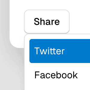
Dialog with MenuShowing a nested dropdown Menu component inside a modal Dialog using React.
Nested DialogRendering a modal Dialog to confirm an action inside another modal dialog using React.
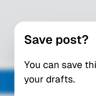
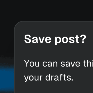
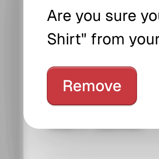
Warning on Dialog hidePreventing users from accidentally closing a modal Dialog component with unsaved changes by displaying a nested confirmation dialog.
Dialog with scrollable backdropRendering a modal Dialog component inside a scrollable backdrop container for dialogs that are
taller than the viewport.


Command Menu with TabsCombining Dialog, Tab, and Combobox from Ariakit React to build a command palette component.
Command MenuCombining Dialog and Combobox to enable users to search a command list in a Raycast-style modal.