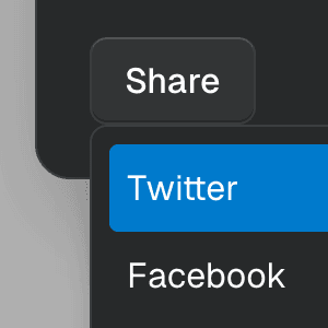
Menu with Tooltip
Rendering Menu with a Tooltip that appears when hovering over the MenuButton
component by combining it with the TooltipAnchor
component.
VoiceOver
Zoom
Invert Colours
Colour Filters
Increase Contrast
Reduce Transparency
1234567891011121314151617181920212223242526272829303132333435363738394041424344454647484950515253
import {} from "@ariakit/react";import "./style.css";export default function Example() {return ({icon});}const icon = (<svgstroke="currentColor"fill="none"strokeWidth="0"viewBox="0 0 15 15"height="20px"width="20px"aria-hidden><pathfillRule="evenodd"clipRule="evenodd"d="M0.877197 7.49984C0.877197 3.84216 3.84234 0.877014 7.50003 0.877014C11.1577 0.877014 14.1229 3.84216 14.1229 7.49984C14.1229 11.1575 11.1577 14.1227 7.50003 14.1227C3.84234 14.1227 0.877197 11.1575 0.877197 7.49984ZM7.50003 1.82701C4.36702 1.82701 1.8272 4.36683 1.8272 7.49984C1.8272 10.6328 4.36702 13.1727 7.50003 13.1727C10.633 13.1727 13.1729 10.6328 13.1729 7.49984C13.1729 4.36683 10.633 1.82701 7.50003 1.82701ZM7.12457 9.00001C7.06994 9.12735 6.33165 11.9592 6.33165 11.9592C6.26018 12.226 5.98601 12.3843 5.71928 12.3128C5.45255 12.2413 5.29425 11.9672 5.36573 11.7004C5.36573 11.7004 6.24661 8.87268 6.24661 8.27007V6.80099L4.28763 6.27608C4.0209 6.20461 3.86261 5.93045 3.93408 5.66371C4.00555 5.39698 4.27972 5.23869 4.54645 5.31016C4.54645 5.31016 6.20042 5.87268 6.84579 5.87268H8.15505C8.80042 5.87268 10.4534 5.31042 10.4534 5.31042C10.7202 5.23895 10.9943 5.39724 11.0658 5.66397C11.1373 5.93071 10.979 6.20487 10.7122 6.27635L8.74661 6.80303V8.27007C8.74661 8.87268 9.62663 11.6971 9.62663 11.6971C9.6981 11.9639 9.5398 12.238 9.27307 12.3095C9.00634 12.381 8.73217 12.2227 8.6607 11.956C8.6607 11.956 7.91994 9.12735 7.86866 9.00001C7.81994 8.87268 7.65006 8.87268 7.65006 8.87268H7.34317C7.34317 8.87268 7.16994 8.87268 7.12457 9.00001ZM7.50043 5.12007C8.12175 5.12007 8.62543 4.61639 8.62543 3.99507C8.62543 3.37375 8.12175 2.87007 7.50043 2.87007C6.87911 2.87007 6.37543 3.37375 6.37543 3.99507C6.37543 4.61639 6.87911 5.12007 7.50043 5.12007Z"fill="currentColor"/></svg>);import {} from "@ariakit/react";import "./style.css";export default function Example() {return ({icon});}const icon = (<svgstroke="currentColor"fill="none"strokeWidth="0"viewBox="0 0 15 15"height="20px"width="20px"aria-hidden><pathfillRule="evenodd"clipRule="evenodd"d="M0.877197 7.49984C0.877197 3.84216 3.84234 0.877014 7.50003 0.877014C11.1577 0.877014 14.1229 3.84216 14.1229 7.49984C14.1229 11.1575 11.1577 14.1227 7.50003 14.1227C3.84234 14.1227 0.877197 11.1575 0.877197 7.49984ZM7.50003 1.82701C4.36702 1.82701 1.8272 4.36683 1.8272 7.49984C1.8272 10.6328 4.36702 13.1727 7.50003 13.1727C10.633 13.1727 13.1729 10.6328 13.1729 7.49984C13.1729 4.36683 10.633 1.82701 7.50003 1.82701ZM7.12457 9.00001C7.06994 9.12735 6.33165 11.9592 6.33165 11.9592C6.26018 12.226 5.98601 12.3843 5.71928 12.3128C5.45255 12.2413 5.29425 11.9672 5.36573 11.7004C5.36573 11.7004 6.24661 8.87268 6.24661 8.27007V6.80099L4.28763 6.27608C4.0209 6.20461 3.86261 5.93045 3.93408 5.66371C4.00555 5.39698 4.27972 5.23869 4.54645 5.31016C4.54645 5.31016 6.20042 5.87268 6.84579 5.87268H8.15505C8.80042 5.87268 10.4534 5.31042 10.4534 5.31042C10.7202 5.23895 10.9943 5.39724 11.0658 5.66397C11.1373 5.93071 10.979 6.20487 10.7122 6.27635L8.74661 6.80303V8.27007C8.74661 8.87268 9.62663 11.6971 9.62663 11.6971C9.6981 11.9639 9.5398 12.238 9.27307 12.3095C9.00634 12.381 8.73217 12.2227 8.6607 11.956C8.6607 11.956 7.91994 9.12735 7.86866 9.00001C7.81994 8.87268 7.65006 8.87268 7.65006 8.87268H7.34317C7.34317 8.87268 7.16994 8.87268 7.12457 9.00001ZM7.50043 5.12007C8.12175 5.12007 8.62543 4.61639 8.62543 3.99507C8.62543 3.37375 8.12175 2.87007 7.50043 2.87007C6.87911 2.87007 6.37543 3.37375 6.37543 3.99507C6.37543 4.61639 6.87911 5.12007 7.50043 5.12007Z"fill="currentColor"/></svg>);
Components
Composing MenuButton
and TooltipAnchor
In this example, we're combining MenuButton
and TooltipAnchor
using the render
prop to create a button that opens a menu when clicked and shows a tooltip when hovered.
You can learn more about this pattern on the Composition guide.
Related examples
MenuItemCheckboxRendering a dropdown Menu using the MenuItemCheckbox component with the values and setValues props from MenuProvider to control the checked items.
Dialog with MenuShowing a nested dropdown Menu component inside a modal Dialog using React.
Command Menu with TabsCombining Dialog, Tab, and Combobox from Ariakit React to build a command palette component.
Command MenuCombining Dialog and Combobox to enable users to search a command list in a Raycast-style modal.