ComboboxGroup
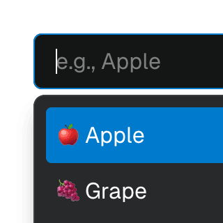
Organizing Combobox items into labelled groups using the ComboboxGroup
and ComboboxGroupLabel
components in React.
1234567891011121314151617181920212223242526272829303132333435363738394041424344454647484950
import groupBy from "lodash-es/groupBy.js";import { matchSorter } from "match-sorter";import * as React from "react";import {} from "./combobox.tsx";import food from "./food.ts";import "./style.css";export default function Example() {const [value, setValue] = React.useState("");const deferredValue = React.useDeferredValue(value);const matches = React.useMemo(() => {const items = matchSorter(food, deferredValue, { keys: ["name"] });return Object.entries(groupBy(items, "type"));}, [deferredValue]);return (<label className="label">Your favorite foodplaceholder="e.g., Apple"value={value}onChange={setValue}>{matches.length ? (matches.map(([type, items], i) => (<React.Fragment key={type}>{items.map((item) => ())}</React.Fragment>))) : (<div className="no-results">No results found</div>)}</label>);}import groupBy from "lodash-es/groupBy.js";import { matchSorter } from "match-sorter";import * as React from "react";import {} from "./combobox.tsx";import food from "./food.ts";import "./style.css";export default function Example() {const [value, setValue] = React.useState("");const deferredValue = React.useDeferredValue(value);const matches = React.useMemo(() => {const items = matchSorter(food, deferredValue, { keys: ["name"] });return Object.entries(groupBy(items, "type"));}, [deferredValue]);return (<label className="label">Your favorite foodplaceholder="e.g., Apple"value={value}onChange={setValue}>{matches.length ? (matches.map(([type, items], i) => (<React.Fragment key={type}>{items.map((item) => ())}</React.Fragment>))) : (<div className="no-results">No results found</div>)}</label>);}
Components
Related examples
Combobox with integrated filterFiltering options in a Combobox component through an abstracted implementation using React.useDeferredValue, resulting in a simple higher-level API.
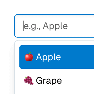
Animated ComboboxAnimating a Combobox using CSS transitions in React. The component waits for the transition to finish before completely hiding the popover.
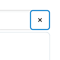
ComboboxCancelReseting the value of a Combobox with a button rendered next to it using the ComboboxCancel component.
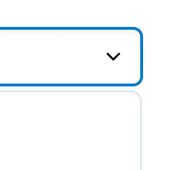
ComboboxDisclosureOpening and closing a Combobox with the help of a button rendered next to it using the ComboboxDisclosure component.
Combobox with linksUsing a Combobox with items rendered as links that can be clicked with keyboard and mouse. This is useful for creating an accessible page search input in React.
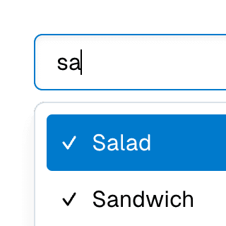
Multi-selectable ComboboxAllowing Combobox to select multiple options by passing an array value to the selectedValue prop.
Combobox with TabsOrganizing Combobox with Tab components that support mouse, keyboard, and screen reader interactions. The UI remains responsive by using React.startTransition.
Command Menu with TabsCombining Dialog, Tab, and Combobox from Ariakit React to build a command palette component.