Textarea with inline Combobox
Rendering Combobox as a textarea element to create an accessible multiline textbox in React. Inserting specific characters triggers a popup with dynamic suggestions.
123456789101112131415161718192021222324252627282930313233343536373839404142434445464748495051525354555657585960616263646566676869707172737475767778798081828384858687888990919293949596979899100101102103104105106107108109110111112113114115116117118119120121122123124125126127128129130131132133134135136137138139140141142143144145146147148
import * as Ariakit from "@ariakit/react";import { matchSorter } from "match-sorter";import * as React from "react";import { getList, getValue } from "./list.ts";import "./style.css";import {getAnchorRect,getSearchValue,getTrigger,getTriggerOffset,replaceValue,} from "./utils.ts";export default function Example() {const ref = React.useRef<HTMLTextAreaElement>(null);const [value, setValue] = React.useState("");const [trigger, setTrigger] = React.useState<string | null>(null);const [caretOffset, setCaretOffset] = React.useState<number | null>(null);const deferredSearchValue = React.useDeferredValue(searchValue);const matches = React.useMemo(() => {return matchSorter(getList(trigger), deferredSearchValue, {baseSort: (a, b) => (a.index < b.index ? -1 : 1),}).slice(0, 10);}, [trigger, deferredSearchValue]);const hasMatches = !!matches.length;React.useLayoutEffect(() => {combobox.setOpen(hasMatches);}, [combobox, hasMatches]);React.useLayoutEffect(() => {if (caretOffset != null) {ref.current?.setSelectionRange(caretOffset, caretOffset);}}, [caretOffset]);// Re-calculates the position of the combobox popover in case the changes on// the textarea value have shifted the trigger character.React.useEffect(combobox.render, [combobox, value]);const onKeyDown = (event: React.KeyboardEvent<HTMLTextAreaElement>) => {if (event.key === "ArrowLeft" || event.key === "ArrowRight") {combobox.hide();}};const onChange = (event: React.ChangeEvent<HTMLTextAreaElement>) => {const trigger = getTrigger(event.target);const searchValue = getSearchValue(event.target);// If there's a trigger character, we'll show the combobox popover. This can// be true both when the trigger character has just been typed and when// content has been deleted (e.g., with backspace) and the character right// before the caret is the trigger.if (trigger) {setTrigger(trigger);combobox.show();}// There will be no trigger and no search value if the trigger character has// just been deleted.else if (!searchValue) {setTrigger(null);combobox.hide();}// Sets our textarea value.setValue(event.target.value);// Sets the combobox value that will be used to search in the list.combobox.setValue(searchValue);};const onItemClick = (value: string) => () => {const textarea = ref.current;if (!textarea) return;const offset = getTriggerOffset(textarea);const displayValue = getValue(value, trigger);if (!displayValue) return;setTrigger(null);setValue(replaceValue(offset, searchValue, displayValue));const nextCaretOffset = offset + displayValue.length + 1;setCaretOffset(nextCaretOffset);};return (<div className="wrapper"><label className="label">Commentvalue={value}// We'll overwrite how the combobox popover is shown, so we disable// the default behaviors.// To the combobox state, we'll only set the value after the trigger// character (the search value), so we disable the default behavior.className="combobox"<textarearef={ref}rows={5}placeholder="Type @, # or :"// We need to re-calculate the position of the combobox popover// when the textarea contents are scrolled.onScroll={combobox.render}// Hide the combobox popover whenever the selection changes.onPointerDown={combobox.hide}onChange={onChange}onKeyDown={onKeyDown}/>}/></label>hidden={!hasMatches}const textarea = ref.current;if (!textarea) return null;return getAnchorRect(textarea);}}className="popover">{matches.map((value) => (key={value}onClick={onItemClick(value)}className="combobox-item"><span>{value}</span>))}</div>);}import * as Ariakit from "@ariakit/react";import { matchSorter } from "match-sorter";import * as React from "react";import { getList, getValue } from "./list.ts";import "./style.css";import {getAnchorRect,getSearchValue,getTrigger,getTriggerOffset,replaceValue,} from "./utils.ts";export default function Example() {const ref = React.useRef<HTMLTextAreaElement>(null);const [value, setValue] = React.useState("");const [trigger, setTrigger] = React.useState<string | null>(null);const [caretOffset, setCaretOffset] = React.useState<number | null>(null);const deferredSearchValue = React.useDeferredValue(searchValue);const matches = React.useMemo(() => {return matchSorter(getList(trigger), deferredSearchValue, {baseSort: (a, b) => (a.index < b.index ? -1 : 1),}).slice(0, 10);}, [trigger, deferredSearchValue]);const hasMatches = !!matches.length;React.useLayoutEffect(() => {combobox.setOpen(hasMatches);}, [combobox, hasMatches]);React.useLayoutEffect(() => {if (caretOffset != null) {ref.current?.setSelectionRange(caretOffset, caretOffset);}}, [caretOffset]);// Re-calculates the position of the combobox popover in case the changes on// the textarea value have shifted the trigger character.React.useEffect(combobox.render, [combobox, value]);const onKeyDown = (event: React.KeyboardEvent<HTMLTextAreaElement>) => {if (event.key === "ArrowLeft" || event.key === "ArrowRight") {combobox.hide();}};const onChange = (event: React.ChangeEvent<HTMLTextAreaElement>) => {const trigger = getTrigger(event.target);const searchValue = getSearchValue(event.target);// If there's a trigger character, we'll show the combobox popover. This can// be true both when the trigger character has just been typed and when// content has been deleted (e.g., with backspace) and the character right// before the caret is the trigger.if (trigger) {setTrigger(trigger);combobox.show();}// There will be no trigger and no search value if the trigger character has// just been deleted.else if (!searchValue) {setTrigger(null);combobox.hide();}// Sets our textarea value.setValue(event.target.value);// Sets the combobox value that will be used to search in the list.combobox.setValue(searchValue);};const onItemClick = (value: string) => () => {const textarea = ref.current;if (!textarea) return;const offset = getTriggerOffset(textarea);const displayValue = getValue(value, trigger);if (!displayValue) return;setTrigger(null);setValue(replaceValue(offset, searchValue, displayValue));const nextCaretOffset = offset + displayValue.length + 1;setCaretOffset(nextCaretOffset);};return (<div className="wrapper"><label className="label">Commentvalue={value}// We'll overwrite how the combobox popover is shown, so we disable// the default behaviors.// To the combobox state, we'll only set the value after the trigger// character (the search value), so we disable the default behavior.className="combobox"<textarearef={ref}rows={5}placeholder="Type @, # or :"// We need to re-calculate the position of the combobox popover// when the textarea contents are scrolled.onScroll={combobox.render}// Hide the combobox popover whenever the selection changes.onPointerDown={combobox.hide}onChange={onChange}onKeyDown={onKeyDown}/>}/></label>hidden={!hasMatches}const textarea = ref.current;if (!textarea) return null;return getAnchorRect(textarea);}}className="popover">{matches.map((value) => (key={value}onClick={onItemClick(value)}className="combobox-item"><span>{value}</span>))}</div>);}
Components
Related examples
Animated ComboboxAnimating a Combobox using CSS transitions in React. The component waits for the transition to finish before completely hiding the popover.
Combobox filteringListing suggestions in a Combobox component based on the input value using React.startTransition to ensure the UI remains responsive during typing.
Combobox with integrated filterFiltering options in a Combobox component through an abstracted implementation using React.useDeferredValue, resulting in a simple higher-level API.
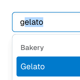
ComboboxGroupOrganizing Combobox items into labelled groups using the ComboboxGroup and ComboboxGroupLabel components in React.
ComboboxDisclosureOpening and closing a Combobox with the help of a button rendered next to it using the ComboboxDisclosure component.
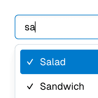
Multi-selectable ComboboxAllowing Combobox to select multiple options by passing an array value to the selectedValue prop.
Combobox with TabsOrganizing Combobox with Tab components that support mouse, keyboard, and screen reader interactions. The UI remains responsive by using React.startTransition.
Command Menu with TabsCombining Dialog, Tab, and Combobox from Ariakit React to build a command palette component.