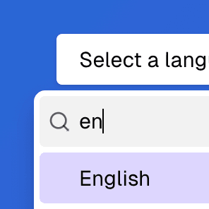
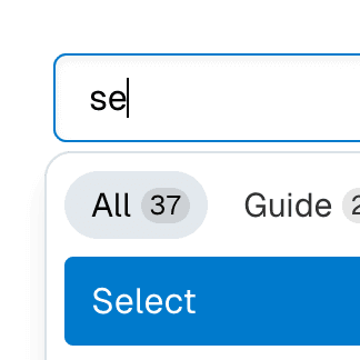
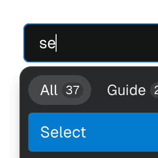
Radix Combobox
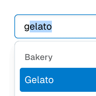
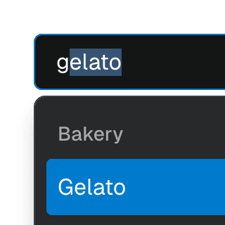
Live example
Components
Explore the Ariakit components used in this example:
Basic structure
<RadixPopover.Root>
<RadixPopover.Anchor asChild>
</RadixPopover.Anchor>
<RadixPopover.Content asChild>
</RadixPopover.Content>
</RadixPopover.Root>
Composing PopoverContent with ComboboxList
Rather than using the ComboboxPopover component from Ariakit, we can use the Radix PopoverContent in conjunction with the Ariakit ComboboxList component, which doesn't bundle popover features.
Here are a few things to keep in mind when assembling these components:
- 1
A combobox typically doesn't auto-focus when it opens, so we need to stop the Radix
onOpenAutoFocusevent from performing its default behavior:<RadixPopover.ContentonOpenAutoFocus={(event) => event.preventDefault()}> - 2
We need to stop Radix from closing the popover when interacting with the
Comboboxor any component withinComboboxList:<RadixPopover.ContentonInteractOutside={(event) => {const isCombobox = comboboxElement === event.target;const inListbox = listboxElement?.contains(event.target);if (isCombobox || inListbox) {event.preventDefault();}}}> - 3
Finally, we must explicitly set
role="listbox"on theComboboxListcomponent, otherwise Radix will overwrite it withrole="dialog".
More examples

Radix Select with ComboboxRendering a searchable Radix UI Select component with a text field that enables typeahead & autocomplete features using the primitive Ariakit Combobox components.


Radix DialogCreating a modal dialog primitive offering the same API as Radix UI but using the Ariakit Dialog component instead.
ComboboxGroupOrganizing Combobox items into labelled groups using the ComboboxGroup and ComboboxGroupLabel components in React.


Combobox with linksUsing a Combobox with items rendered as links that can be clicked with keyboard and mouse. This is useful for creating an accessible page search input in React.

ComboboxDisclosureOpening and closing a Combobox with the help of a button rendered next to it using the ComboboxDisclosure component.

ComboboxCancelReseting the value of a Combobox with a button rendered next to it using the ComboboxCancel component.
Combobox with TabsOrganizing Combobox with Tab components that support mouse, keyboard, and screen reader interactions. The UI remains responsive by using React.startTransition.


Command Menu with TabsCombining Dialog, Tab, and Combobox from Ariakit React to build a command palette component.