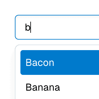
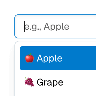
Combobox with links
Using a Combobox with items rendered as links that can be clicked with keyboard and mouse. This is useful for creating an accessible page search input in React.
Components
Rendering a link
The ComboboxItem component can be rendered as a link using the render prop:
{...specificComboboxItemProps}
/>
You can learn more about this pattern on the Composition guide.
Link features
When rendered as a link, ComboboxItem supports all native link behaviors, including:
Open in a new tab in the background: ⌘ Enter
Open in a new tab and switch to the tab: ⌘ Shift Enter
Open in new window: Shift Enter
Download: Alt Enter
Related examples
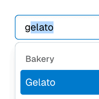
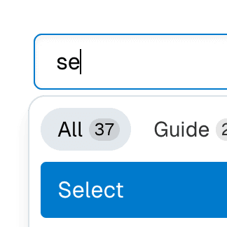
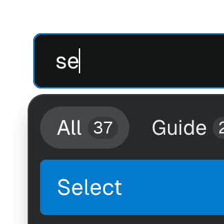
Combobox filteringListing suggestions in a Combobox component based on the input value using React.startTransition to ensure the UI remains responsive during typing.
Combobox with integrated filterFiltering options in a Combobox component through an abstracted implementation using React.useDeferredValue, resulting in a simple higher-level API.
Animated ComboboxAnimating a Combobox using CSS transitions in React. The component waits for the transition to finish before completely hiding the popover.
ComboboxGroupOrganizing Combobox items into labelled groups using the ComboboxGroup and ComboboxGroupLabel components in React.

ComboboxCancelReseting the value of a Combobox with a button rendered next to it using the ComboboxCancel component.
Combobox with TabsOrganizing Combobox with Tab components that support mouse, keyboard, and screen reader interactions. The UI remains responsive by using React.startTransition.


Command Menu with TabsCombining Dialog, Tab, and Combobox from Ariakit React to build a command palette component.
Navigation MenubarUsing Menubar, Menu, and Portal to create an accessible, tabbable navigation menu widget with links and menu buttons that expand on hover and focus.