ComboboxDisclosure
Opening and closing a Combobox with the help of a button rendered next to it using the ComboboxDisclosure component.
Components
Related examples
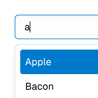
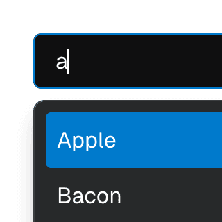
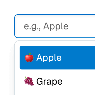
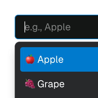
Combobox with integrated filterFiltering options in a Combobox component through an abstracted implementation using React.useDeferredValue, resulting in a simple higher-level API.
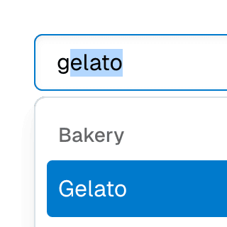
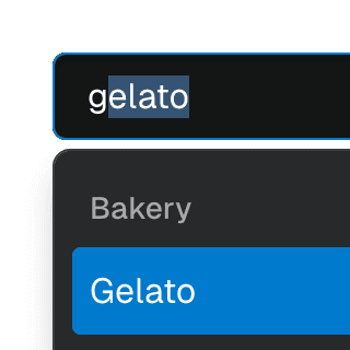
ComboboxGroupOrganizing Combobox items into labelled groups using the ComboboxGroup and ComboboxGroupLabel components in React.
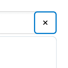

ComboboxCancelReseting the value of a Combobox with a button rendered next to it using the ComboboxCancel component.


Combobox with linksUsing a Combobox with items rendered as links that can be clicked with keyboard and mouse. This is useful for creating an accessible page search input in React.
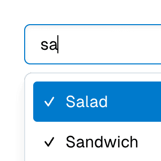
Multi-selectable ComboboxAllowing Combobox to select multiple options by passing an array value to the selectedValue prop.
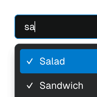
Animated ComboboxAnimating a Combobox using CSS transitions in React. The component waits for the transition to finish before completely hiding the popover.
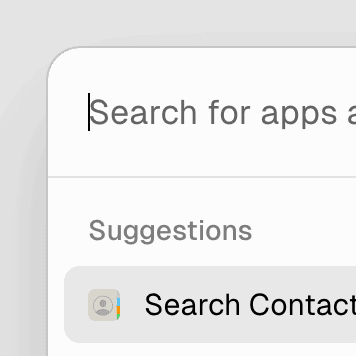
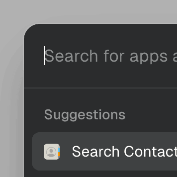
Command MenuCombining Dialog and Combobox to enable users to search a command list in a Raycast-style modal.