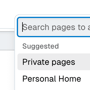
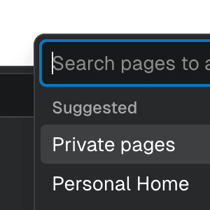
Select with Combobox
Related examples
Select with Combobox and TabsAbstracting Select to work alongside Combobox and Tab components, presenting a searchable, tabbed dropdown.
Menu with ComboboxCombining Menu and Combobox to create a dropdown menu with a search field that can be used to filter menu items.
Submenu with ComboboxNesting Notion-style dropdown menus with search & autocomplete features by combining Menu with Combobox.
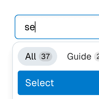
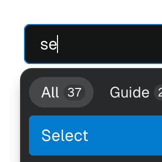
Combobox with TabsOrganizing Combobox with Tab components that support mouse, keyboard, and screen reader interactions. The UI remains responsive by using React.startTransition.


Command Menu with TabsCombining Dialog, Tab, and Combobox from Ariakit React to build a command palette component.

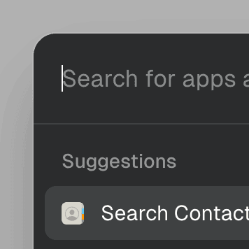
Command MenuCombining Dialog and Combobox to enable users to search a command list in a Raycast-style modal.