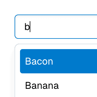
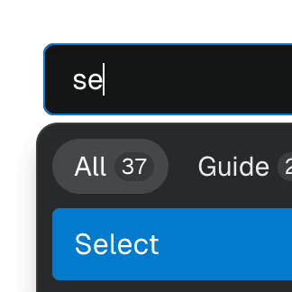
Combobox with integrated filter
Filtering options in a Combobox component through an abstracted implementation using React.useDeferredValue, resulting in a simple higher-level API.
Related examples
Combobox filteringListing suggestions in a Combobox component based on the input value using React.startTransition to ensure the UI remains responsive during typing.
Animated ComboboxAnimating a Combobox using CSS transitions in React. The component waits for the transition to finish before completely hiding the popover.
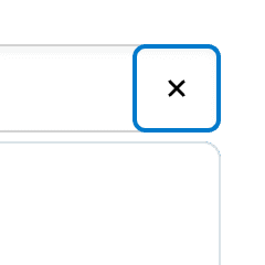

ComboboxCancelReseting the value of a Combobox with a button rendered next to it using the ComboboxCancel component.


Combobox with linksUsing a Combobox with items rendered as links that can be clicked with keyboard and mouse. This is useful for creating an accessible page search input in React.
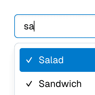
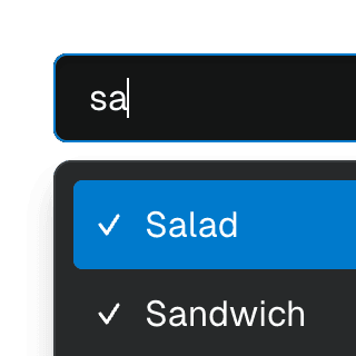
Multi-selectable ComboboxAllowing Combobox to select multiple options by passing an array value to the selectedValue prop.
Combobox with TabsOrganizing Combobox with Tab components that support mouse, keyboard, and screen reader interactions. The UI remains responsive by using React.startTransition.


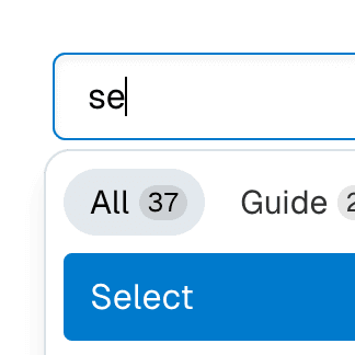
Command Menu with TabsCombining Dialog, Tab, and Combobox from Ariakit React to build a command palette component.


Submenu with ComboboxNesting Notion-style dropdown menus with search & autocomplete features by combining Menu with Combobox.