Radix Dialog
Components
Browser extensions and third-party dialogs
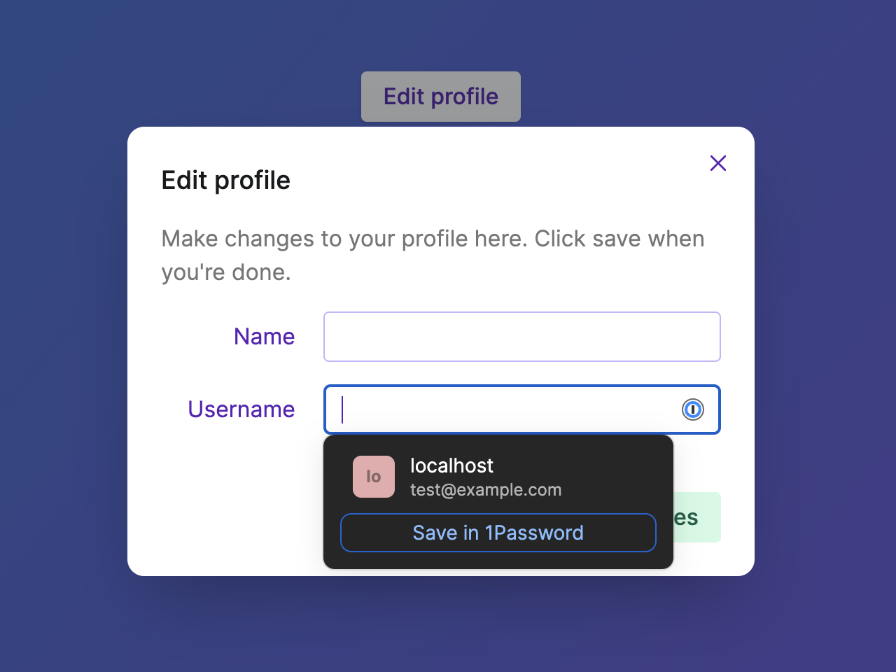
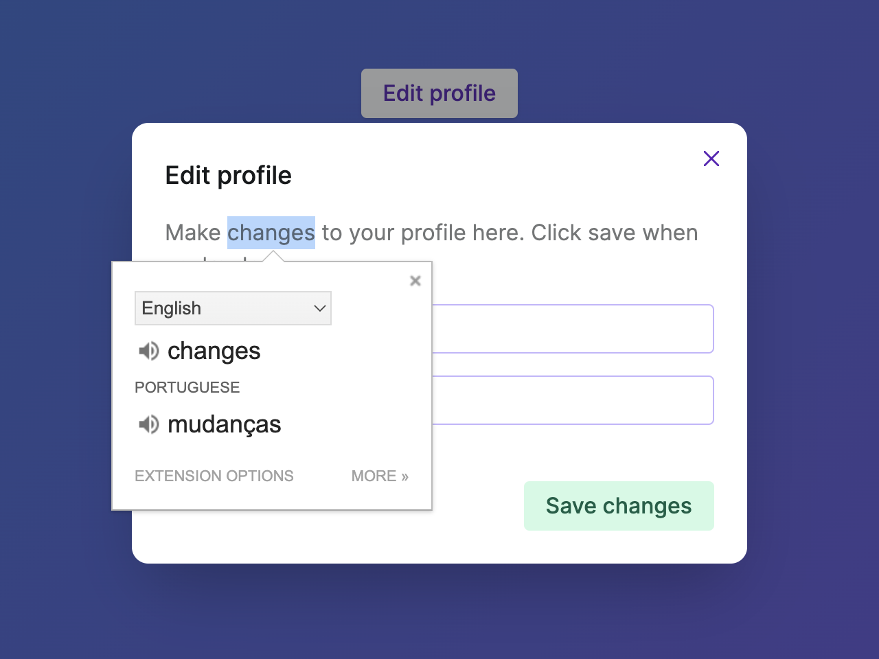
The Ariakit Dialog component seamlessly integrates with browser extensions that open popups, such as 1Password, Grammarly, Google Translate, and many others. This ensures that users can interact with the extension while keeping the modal dialog open, using both keyboard and mouse inputs. The same is true for third-party libraries that open dialogs.
For elements that are already in the DOM, the getPersisentElements prop can be used to specify which elements should remain accessible when the modal dialog is open. This is useful to integrate with chat widgets like Intercom, toast libraries like react-toastify and react-hot-toast, and more. See the Dialog with React-Toastify example for a practical use case.
Focus trap elements
Most component libraries render visually hidden elements around the modal dialog to prevent users from tabbing to elements outside. The Ariakit Dialog component follows a different approach: there are no focus trap elements. Instead, the elements that are not part of the modal context are given the inert attribute on browsers that support it. An alternative method is used on older browsers, but the result is the same.
This allows keyboard and screen reader users to Tab to the browser chrome, where they can interact with the URL address bar, or leave an iframe, which mouse users could do already.
This approach results in a behavior that is more consistent with the native dialog element. Unfortunately, the native dialog element still doesn't work with browser extensions when opened as a modal.
Scrollable backdrop
The Ariakit Dialog component automatically closes when users click outside the dialog. This behavior is controlled by the hideOnInteractOutside prop, which is enabled by default.
However, Ariakit will make sure the dialog is not closed when users interact with the scrollbar on a backdrop container. See the Dialog with scrollable backdrop example for a practical use case.
Related examples