Nested Dialog
Components
DialogOpen a new window that can be either modal or non-modal and optionally rendered in a React portal. This component is based on the WAI-ARIA Dialog Pattern.
ButtonTrigger an action or event, such as submitting a Form, opening a Dialog, canceling an action, or performing a delete operation in React. This component is based on the WAI-ARIA Button Pattern.
VisuallyHiddenHide an element visually but keep it available for screen readers and other assistive technologies.
Identifying nested dialogs
There are three ways Ariakit can identify nested dialogs:
- 1
They are nested in the React tree.
- 2
They are appended to the body element after the parent dialog is opened.
- 3
They are referenced in the
getPersistentElementsprop of the parent dialog.
In this example, we're using the second method. By passing the unmountOnHide prop to the nested dialog, it's rendered only when the dialog is open. This is the same strategy used by the Dialog module to support third-party dialogs and browser extensions that open popups, such as 1Password, Google Translate, and Grammarly.
Related examples
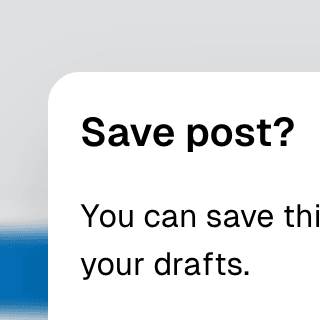
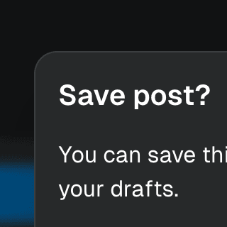
Warning on Dialog hidePreventing users from accidentally closing a modal Dialog component with unsaved changes by displaying a nested confirmation dialog.
Animated DialogAnimating a modal Dialog and its backdrop element using CSS. The component waits for the transition to finish before completely hiding the dialog or removing it from the React tree.
Dialog with scrollable backdropRendering a modal Dialog component inside a scrollable backdrop container for dialogs that are
taller than the viewport.
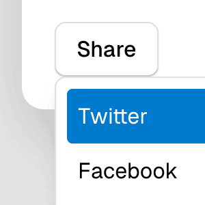
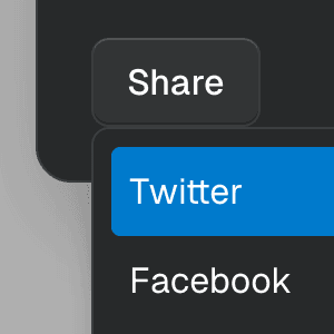
Dialog with MenuShowing a nested dropdown Menu component inside a modal Dialog using React.


Command Menu with TabsCombining Dialog, Tab, and Combobox from Ariakit React to build a command palette component.
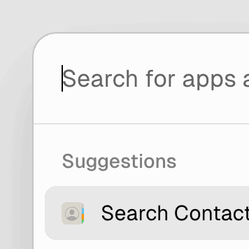
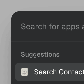
Command MenuCombining Dialog and Combobox to enable users to search a command list in a Raycast-style modal.
SubmenuRendering nested Menu components to create a dropdown menu with submenus that open when hovering over the parent menu item.
Navigation MenubarUsing Menubar, Menu, and Portal to create an accessible, tabbable navigation menu widget with links and menu buttons that expand on hover and focus.