Dialog with Menu
123456789101112131415161718192021222324252627282930313233343536373839
Components
DialogOpen a new window that can be either modal or non-modal and optionally rendered in a React portal. This component is based on the WAI-ARIA Dialog Pattern.
MenuAccess a set of commands within a dropdown menu. This component is based on the WAI-ARIA Menu Pattern and the WAI-ARIA Menu Button Pattern.
ButtonTrigger an action or event, such as submitting a Form, opening a Dialog, canceling an action, or performing a delete operation in React. This component is based on the WAI-ARIA Button Pattern.
Related examples
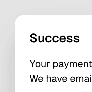

Animated DialogAnimating a modal Dialog and its backdrop element using CSS. The component waits for the transition to finish before completely hiding the dialog or removing it from the React tree.
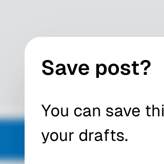
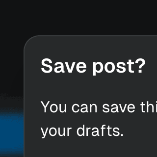
Warning on Dialog hidePreventing users from accidentally closing a modal Dialog component with unsaved changes by displaying a nested confirmation dialog.
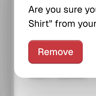
Nested DialogRendering a modal Dialog to confirm an action inside another modal dialog using React.
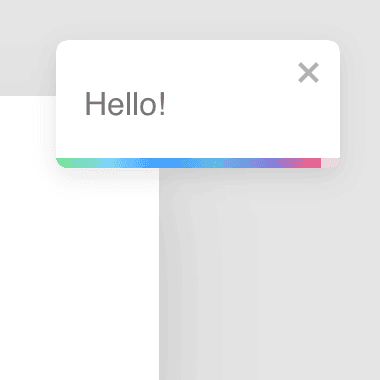
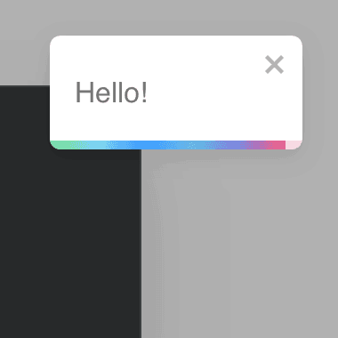
Dialog with React-ToastifyShowing notification toasts using libraries like react-toastify and react-hot-toast while keeping a modal Dialog open with the getPersistentElements prop.


Command Menu with TabsCombining Dialog, Tab, and Combobox from Ariakit React to build a command palette component.
SubmenuRendering nested Menu components to create a dropdown menu with submenus that open when hovering over the parent menu item.
Menu with TooltipRendering Menu with a Tooltip that appears when hovering over the MenuButton component by combining it with the TooltipAnchor component.