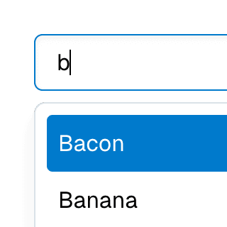
Animated Combobox
Animating a Combobox using CSS transitions in React. The component waits for the transition to finish before completely hiding the popover.
Components
Styling
Ariakit will automatically assign the data-enter and data-leave attributes to the popover element when it opens and closes. You can use these attributes as selectors to add CSS transitions to the popover.
.popover {
opacity: 0;
transition: opacity 150ms;
}
.popover[data-enter] {
opacity: 1;
}
For more information, refer to the Styling guide.
Related examples
Combobox filteringListing suggestions in a Combobox component based on the input value using React.startTransition to ensure the UI remains responsive during typing.


Command Menu with TabsCombining Dialog, Tab, and Combobox from Ariakit React to build a command palette component.

Animated DialogAnimating a modal Dialog and its backdrop element using CSS. The component waits for the transition to finish before completely hiding the dialog or removing it from the React tree.
Animated DisclosureApplying plain CSS transitions to Disclosure components to animate the DisclosureContent height as it expands and collapses.
Animated SelectAnimating Select using CSS transitions in React. The component waits for the transition to finish before completely hiding the popover.
Animated TabPanelUsing plain CSS transitions to slide in and out TabPanel components as they are expanded.