Animated Select
Animating Select using CSS transitions in React. The component waits for the transition to finish before completely hiding the popover.
Components
Styling the animation
Use the data-enter and data-leave attributes to animate the SelectPopover component using CSS transitions:
.popover {
opacity: 0;
transition: opacity 150ms;
}
.popover[data-enter] {
opacity: 1;
}
For more information on styling with Ariakit, refer to the Styling guide.
Related examples
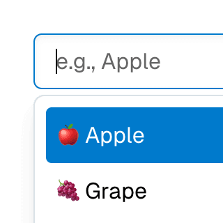
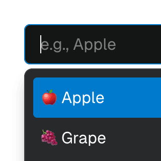
Select with ComboboxCombining Select and Combobox to create a dropdown with a search field that can be used to filter items.
SelectGroupSeparating Select items into groups using the SelectGroup and SelectGroupLabel components.
Animated DialogAnimating a modal Dialog and its backdrop element using CSS. The component waits for the transition to finish before completely hiding the dialog or removing it from the React tree.
Animated ComboboxAnimating a Combobox using CSS transitions in React. The component waits for the transition to finish before completely hiding the popover.
Toolbar with SelectRendering Select as a ToolbarItem inside a Toolbar.
Select with Next.js App RouterControlling the value of a Select component via the URL using the Next.js App Router and React.useOptimistic to ensure a responsive and accessible UI.