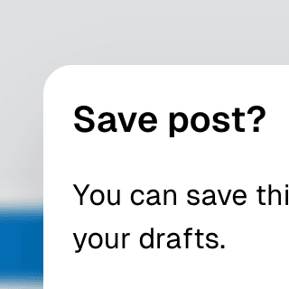
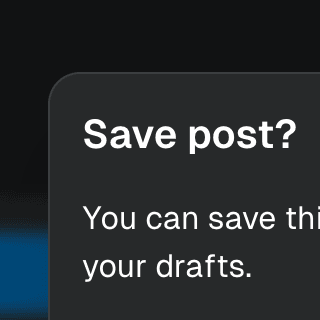
Dialog with Framer Motion
Using Framer Motion to add initial and exit animations to a modal Dialog and its backdrop element.
Components
DialogOpen a new window that can be either modal or non-modal and optionally rendered in a React portal. This component is based on the WAI-ARIA Dialog Pattern.
ButtonTrigger an action or event, such as submitting a Form, opening a Dialog, canceling an action, or performing a delete operation in React. This component is based on the WAI-ARIA Button Pattern.
AnimatePresence
We use the AnimatePresence component from Framer Motion to animate the Ariakit Dialog component when it gets mounted and unmounted from the DOM.
<AnimatePresence>
{mounted && (
<motion.div
initial={{ opacity: 0 }}
animate={{ opacity: 1 }}
exit={{ opacity: 0 }}
/>
}
<motion.div
initial={{ opacity: 0, scale: 0.95 }}
animate={{ opacity: 1, scale: 1 }}
exit={{ opacity: 0, scale: 0.95 }}
/>
}
/>
)}
</AnimatePresence>
To dynamically render the dialog component, you can use the mounted state that can be retrieved from the store:
You can learn more about reading state from the store on the Component stores guide.
Related examples
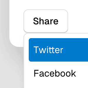
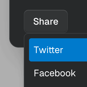
Menu with Framer MotionAbstracting Menu into a reusable dropdown menu component that uses Framer Motion to create smooth initial and exit animations.
Tooltip with Framer MotionAbstracting Tooltip into a reusable custom component that uses Framer Motion to create smooth initial and exit animations.
Dialog with MenuShowing a nested dropdown Menu component inside a modal Dialog using React.
Nested DialogRendering a modal Dialog to confirm an action inside another modal dialog using React.
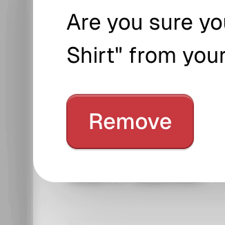
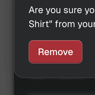
Warning on Dialog hidePreventing users from accidentally closing a modal Dialog component with unsaved changes by displaying a nested confirmation dialog.


Command Menu with TabsCombining Dialog, Tab, and Combobox from Ariakit React to build a command palette component.
Navigation MenubarUsing Menubar, Menu, and Portal to create an accessible, tabbable navigation menu widget with links and menu buttons that expand on hover and focus.