Combobox with Tabs
Organizing Combobox with Tab components that support mouse, keyboard, and screen reader interactions. The UI remains responsive by using React.startTransition
.
123456789101112131415161718192021222324252627282930313233343536373839404142434445464748495051525354555657585960616263646566676869707172737475767778798081828384
import groupBy from "lodash-es/groupBy.js";import { matchSorter } from "match-sorter";import { useId, useMemo, useState } from "react";import {ComboboxPanel,ComboboxTab,ComboboxTabList,} from "./combobox.tsx";import { flatPages, pages } from "./pages.ts";import "./style.css";const categories = ["All", ...Object.keys(pages)];function getTabId(category: string, prefix: string) {return `${prefix}/${category}`;}function getCategory(tabId: string, prefix: string) {return tabId.replace(`${prefix}/`, "");}export default function Example() {const prefix = useId();const [searchValue, setSearchValue] = useState("");const [tabId, setTabId] = useState(getTabId("Components", prefix));const matches = useMemo(() => {const keys = ["label", "path"];const allMatches = matchSorter(flatPages, searchValue, { keys });const groups = groupBy(allMatches, "category");groups.All = allMatches;return groups;}, [searchValue]);const currentPages = matches[getCategory(tabId, prefix)] || [];return (defaultTabId={tabId}onTabChange={setTabId}onSearch={setSearchValue}><ComboboxTabList aria-label="Categories">{categories.map((category) => {const currentPages = matches[category];return (<ComboboxTabkey={category}id={getTabId(category, prefix)}>{category}<span className="count">{currentPages?.length || 0}</span></ComboboxTab>);})}</ComboboxTabList><ComboboxPanel>{!currentPages.length && (<div className="no-results">No pages found for "<strong>{searchValue}</strong>"</div>)}{currentPages.map((page, i) => (key={page.path + i}>{page.label}))}</ComboboxPanel>);}import groupBy from "lodash-es/groupBy.js";import { matchSorter } from "match-sorter";import { useId, useMemo, useState } from "react";import {ComboboxPanel,ComboboxTab,ComboboxTabList,} from "./combobox.tsx";import { flatPages, pages } from "./pages.ts";import "./style.css";const categories = ["All", ...Object.keys(pages)];function getTabId(category: string, prefix: string) {return `${prefix}/${category}`;}function getCategory(tabId: string, prefix: string) {return tabId.replace(`${prefix}/`, "");}export default function Example() {const prefix = useId();const [searchValue, setSearchValue] = useState("");const [tabId, setTabId] = useState(getTabId("Components", prefix));const matches = useMemo(() => {const keys = ["label", "path"];const allMatches = matchSorter(flatPages, searchValue, { keys });const groups = groupBy(allMatches, "category");groups.All = allMatches;return groups;}, [searchValue]);const currentPages = matches[getCategory(tabId, prefix)] || [];return (defaultTabId={tabId}onTabChange={setTabId}onSearch={setSearchValue}><ComboboxTabList aria-label="Categories">{categories.map((category) => {const currentPages = matches[category];return (<ComboboxTabkey={category}id={getTabId(category, prefix)}>{category}<span className="count">{currentPages?.length || 0}</span></ComboboxTab>);})}</ComboboxTabList><ComboboxPanel>{!currentPages.length && (<div className="no-results">No pages found for "<strong>{searchValue}</strong>"</div>)}{currentPages.map((page, i) => (key={page.path + i}>{page.label}))}</ComboboxPanel>);}
Related examples
Command Menu with TabsCombining Dialog, Tab, and Combobox from Ariakit React to build a command palette component.
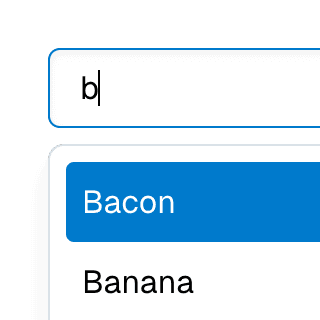
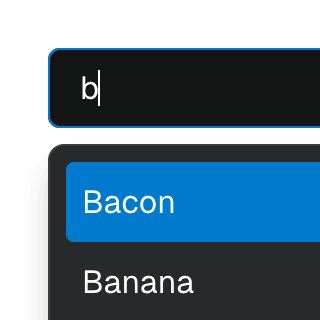
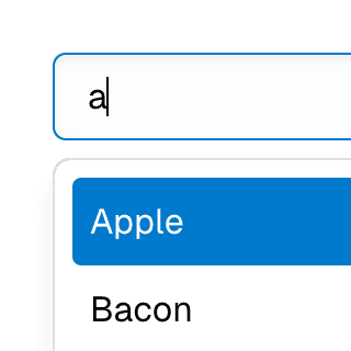
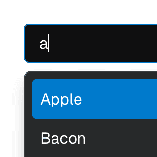
Combobox filteringListing suggestions in a Combobox component based on the input value using React.startTransition to ensure the UI remains responsive during typing.
Combobox with integrated filterFiltering options in a Combobox component through an abstracted implementation using React.useDeferredValue, resulting in a simple higher-level API.
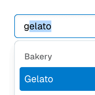
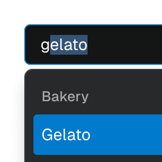
ComboboxGroupOrganizing Combobox items into labelled groups using the ComboboxGroup and ComboboxGroupLabel components in React.
Combobox with linksUsing a Combobox with items rendered as links that can be clicked with keyboard and mouse. This is useful for creating an accessible page search input in React.
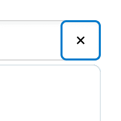
ComboboxCancelReseting the value of a Combobox with a button rendered next to it using the ComboboxCancel component.
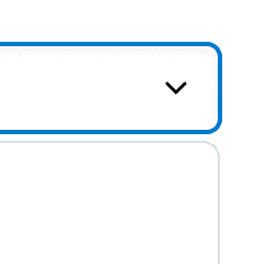
ComboboxDisclosureOpening and closing a Combobox with the help of a button rendered next to it using the ComboboxDisclosure component.
Select with Combobox and TabsAbstracting Select to work alongside Combobox and Tab components, presenting a searchable, tabbed dropdown.