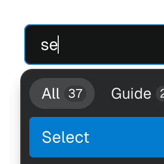
Radix Select with Combobox
Components
Explore the Ariakit components used in this example:
Basic structure
<RadixSelect.Root>
<RadixSelect.Trigger />
<RadixSelect.Content>
<RadixSelect.Item asChild>
</RadixSelect.Item>
</RadixSelect.Content>
</RadixSelect.Root>
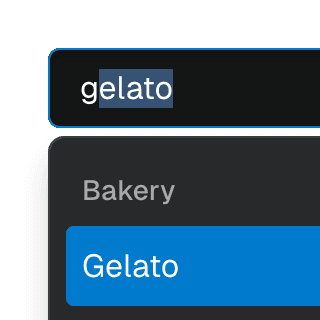
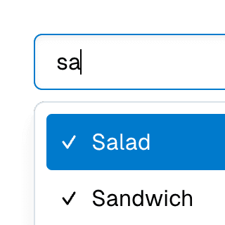
Filtering options
The Ariakit Combobox component doesn't dictate how you filter the items. It focuses solely on the ComboboxItem elements you render. Consequently, you can render items conditionally based on the value state.
We use the setValue callback in combination with React.startTransition to update our search value state without blocking the UI:
const [searchValue, setSearchValue] = useState("");
React.startTransition(() => {
setSearchValue(value);
});
}}
>
You're free to use any matching algorithm or library to filter the items. In this example, we use match-sorter:
const matches = useMemo(() => {
return matchSorter(languages, searchValue, {
keys: ["label", "value"],
});
}, [languages, searchValue]);
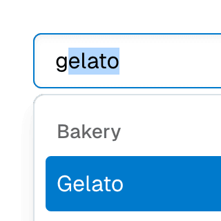
Rendering SelectItem as ComboboxItem
To get the items to function as both a Radix SelectItem and an Ariakit ComboboxItem, we have to combine the two components:
<RadixSelect.Item value="en" asChild>
<RadixSelect.ItemText>English</RadixSelect.ItemText>
</RadixSelect.Item>
More examples

Radix ComboboxUsing just the necessary Ariakit components to build a Combobox with Radix UI. For projects already using Radix UI and looking for autocomplete, autosuggest and search features.


Radix DialogCreating a modal dialog primitive offering the same API as Radix UI but using the Ariakit Dialog component instead.
Menu with ComboboxCombining Menu and Combobox to create a dropdown menu with a search field that can be used to filter menu items.
Select with ComboboxCombining Select and Combobox to create a dropdown with a search field that can be used to filter items.
Combobox filteringListing suggestions in a Combobox component based on the input value using React.startTransition to ensure the UI remains responsive during typing.
ComboboxGroupOrganizing Combobox items into labelled groups using the ComboboxGroup and ComboboxGroupLabel components in React.
Multi-selectable ComboboxAllowing Combobox to select multiple options by passing an array value to the selectedValue prop.
Combobox with TabsOrganizing Combobox with Tab components that support mouse, keyboard, and screen reader interactions. The UI remains responsive by using React.startTransition.