Ariakit
/

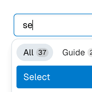
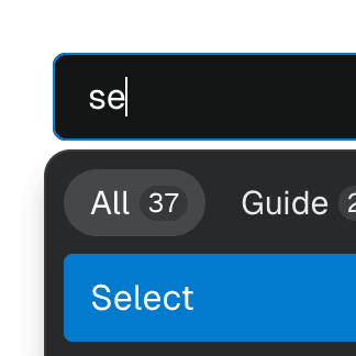
Select with Combobox and Tabs

Abstracting Select to work alongside Combobox and Tab components, presenting a searchable, tabbed dropdown.

import { matchSorter } from "match-sorter";
import { useMemo, useState } from "react";
import * as defaultData from "./data.ts";
import { BranchIcon, TagIcon } from "./icons.tsx";
import {
SelectTab,
SelectTabList,
SelectTabPanel,
} from "./select.tsx";
import type { SelectProps } from "./select.tsx";
import "./theme.css";
export default function Example() {
const [data, setData] = useState(defaultData);
const [tab, setTab] = useState<SelectProps["tab"]>("branches");
const [value, setValue] = useState("main");
const [searchValue, setSearchValue] = useState("");
const values = tab && tab in data ? data[tab as keyof typeof data] : null;
const matches = useMemo(() => {
if (!values) return [];
if (!searchValue) return values;
return matchSorter(values, searchValue);
}, [values, searchValue]);
const TabIcon = tab === "branches" ? BranchIcon : TagIcon;
const placeholder =
tab === "branches" ? "Find or create a branch..." : "Find a tag...";
const canAddBranch =
!!searchValue && !matches.includes(searchValue) && tab === "branches";
const customItem = canAddBranch && (
<>
{!!matches.length && <SelectSeparator />}
icon={<BranchIcon />}
value={searchValue}
onClick={() => {
setData((data) => ({
...data,
branches: [...data.branches, searchValue],
}));
}}
>
Create branch <strong>{searchValue}</strong> from{" "}
<strong>{value}</strong>
</>
);
const empty = !matches.length && (
<div className="py-6 text-center">No matches found</div>
);
return (
<div className="flex max-w-full flex-wrap justify-center gap-2">
label={<div hidden>Select</div>}
icon={<TabIcon />}
value={value}
setValue={setValue}
>
{values?.map((value) => (
<SelectItem key={value} value={value} />
))}
</Select>
label={<div hidden>Select with Combobox</div>}
icon={<TabIcon />}
combobox={<input placeholder={placeholder} />}
value={value}
setValue={setValue}
onSearch={setSearchValue}
>
{matches?.map((value) => (
<SelectItem key={value} value={value} />
))}
{customItem || empty}
</Select>
label={<div hidden>Select with Tab</div>}
icon={<TabIcon />}
tab={tab}
setTab={setTab}
value={value}
setValue={setValue}
>
<SelectTabList>
<SelectTab id="branches">Branches</SelectTab>
<SelectTab id="tags">Tags</SelectTab>
</SelectTabList>
<SelectTabPanel>
{values?.map((value) => (
<SelectItem key={value} value={value} />
))}
</SelectTabPanel>
</Select>
label={<div hidden>Select with Combobox and Tab</div>}
icon={<TabIcon />}
heading="Switch branches/tags"
combobox={<input placeholder={placeholder} />}
tab={tab}
setTab={setTab}
value={value}
setValue={setValue}
onSearch={setSearchValue}
>
<SelectTabList>
<SelectTab id="branches">Branches</SelectTab>
<SelectTab id="tags">Tags</SelectTab>
</SelectTabList>
<SelectTabPanel>
{matches.map((value) => (
<SelectItem key={value} value={value} />
))}
{customItem || empty}
</SelectTabPanel>
</Select>
</div>
);
}

Stay tuned

Join 1,000+ subscribers and receive monthly tips & updates on new Ariakit content.

No spam. Unsubscribe anytime. Read latest issue