Command Menu
123456789101112131415161718192021222324252627282930313233343536373839404142434445464748495051525354555657585960616263646566676869707172737475767778
import { matchSorter } from "match-sorter";import { useMemo, useState } from "react";import {CommandMenu,CommandMenuGroup,CommandMenuInput,CommandMenuItem,CommandMenuList,} from "./command-menu.tsx";import { allItems, applications, commands, suggestions } from "./commands.tsx";import "./style.css";function search(value: string): Record<string, Command[]> {if (!value) {return {Suggestions: suggestions,Commands: commands.filter((item) => !suggestions.includes(item)),Apps: applications.filter((item) => !suggestions.includes(item)),};}const keys = ["name", "title"];const results = matchSorter(allItems, value, { keys });if (!results.length) return {};return { Results: results };}export default function Example() {const [open, setOpen] = useState(false);const [searchValue, setSearchValue] = useState("");const matches = useMemo(() => search(searchValue), [searchValue]);const matchEntries = Object.entries(matches);return (<>Open Command Menu<CommandMenuaria-label="Command Menu"open={open}onOpenChange={setOpen}onSearch={setSearchValue}><CommandMenuInput placeholder="Search for apps and commands..." /><CommandMenuList>{!matchEntries.length && (<div className="no-results">No results found</div>)}{matchEntries.map(([group, items]) => (<CommandMenuGroup key={group} label={group}>{items.map((item) => (<CommandMenuItem key={item.name} id={item.name}>{item.icon && (<span className="item-icon" aria-hidden>{item.icon}</span>)}{item.title}{item.extension?.title && (<span className="item-group" aria-hidden>{item.extension?.title}</span>)}<span className="item-type" aria-hidden>{item.extension ? "Command" : "Application"}</span></CommandMenuItem>))}</CommandMenuGroup>))}</CommandMenuList></CommandMenu></>);}import { matchSorter } from "match-sorter";import { useMemo, useState } from "react";import {CommandMenu,CommandMenuGroup,CommandMenuInput,CommandMenuItem,CommandMenuList,} from "./command-menu.tsx";import { allItems, applications, commands, suggestions } from "./commands.tsx";import "./style.css";function search(value: string): Record<string, Command[]> {if (!value) {return {Suggestions: suggestions,Commands: commands.filter((item) => !suggestions.includes(item)),Apps: applications.filter((item) => !suggestions.includes(item)),};}const keys = ["name", "title"];const results = matchSorter(allItems, value, { keys });if (!results.length) return {};return { Results: results };}export default function Example() {const [open, setOpen] = useState(false);const [searchValue, setSearchValue] = useState("");const matches = useMemo(() => search(searchValue), [searchValue]);const matchEntries = Object.entries(matches);return (<>Open Command Menu<CommandMenuaria-label="Command Menu"open={open}onOpenChange={setOpen}onSearch={setSearchValue}><CommandMenuInput placeholder="Search for apps and commands..." /><CommandMenuList>{!matchEntries.length && (<div className="no-results">No results found</div>)}{matchEntries.map(([group, items]) => (<CommandMenuGroup key={group} label={group}>{items.map((item) => (<CommandMenuItem key={item.name} id={item.name}>{item.icon && (<span className="item-icon" aria-hidden>{item.icon}</span>)}{item.title}{item.extension?.title && (<span className="item-group" aria-hidden>{item.extension?.title}</span>)}<span className="item-type" aria-hidden>{item.extension ? "Command" : "Application"}</span></CommandMenuItem>))}</CommandMenuGroup>))}</CommandMenuList></CommandMenu></>);}
Related examples
Command Menu with TabsCombining Dialog, Tab, and Combobox from Ariakit React to build a command palette component.
Combobox with linksUsing a Combobox with items rendered as links that can be clicked with keyboard and mouse. This is useful for creating an accessible page search input in React.
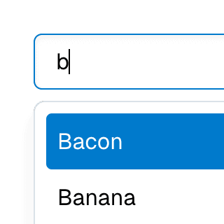
Combobox filteringListing suggestions in a Combobox component based on the input value using React.startTransition to ensure the UI remains responsive during typing.
Combobox with TabsOrganizing Combobox with Tab components that support mouse, keyboard, and screen reader interactions. The UI remains responsive by using React.startTransition.
Dialog with MenuShowing a nested dropdown Menu component inside a modal Dialog using React.
Nested DialogRendering a modal Dialog to confirm an action inside another modal dialog using React.
Menu with ComboboxCombining Menu and Combobox to create a dropdown menu with a search field that can be used to filter menu items.
Select with ComboboxCombining Select and Combobox to create a dropdown with a search field that can be used to filter items.