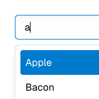
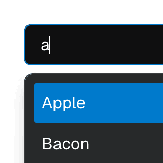
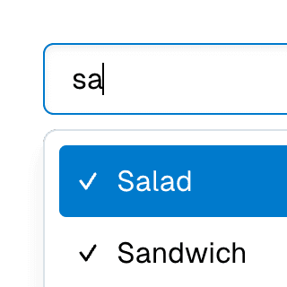
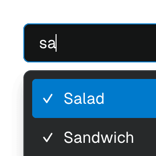
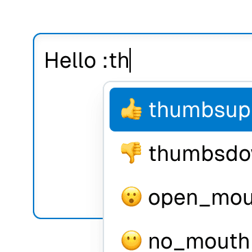
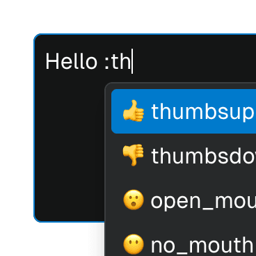
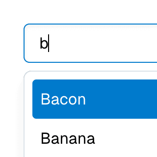
ComboboxItem
Renders a combobox item inside
ComboboxList or
ComboboxPopover
components.
By default, the value
prop will be rendered as the children, but this can be overriden.
Code examples
Optional Props
accessibleWhenDisabled
boolean | undefined
Indicates whether the element should be focusable even when it is
disabled.
This is important when discoverability is a concern. For example:
A toolbar in an editor contains a set of special smart paste functions that are disabled when the clipboard is empty or when the function is not applicable to the current content of the clipboard. It could be helpful to keep the disabled buttons focusable if the ability to discover their functionality is primarily via their presence on the toolbar.
Learn more on Focusability of disabled controls.
Live examples


autoFocus
boolean | undefined = false
Automatically focuses the element upon mounting, similar to the native
autoFocus prop. This addresses an issue where the element with the native
autoFocus attribute might receive focus before React effects are
executed.
The autoFocus prop can also be used with
Focusable elements within a
Dialog component, establishing the
initial focus as the dialog opens.
Note: For this prop to work, the
focusable prop must be
set to true, if it's not set by default.
Live examples
blurOnHoverEnd
BooleanOrCallback<React.MouseEvent<HTMLElement, MouseEvent>> | undefined
Determines if the composite item should lose focus when the mouse leaves.
By default, this is set to true if
focusOnHover
is true.
Live examples
clickOnEnter
boolean | undefined = true
If set to true, pressing the enter key while this element is focused will
trigger a click on the element, regardless of whether it's a native button
or not. If this prop is set to false, pressing enter will not initiate a
click.
clickOnSpace
boolean | undefined = true
If set to true, pressing and releasing the space key while this element
is focused will trigger a click on the element, regardless of whether it's
a native button or not. If this prop is set to false, space will not
initiate a click.
disabled
boolean | undefined = false
Determines if the element is disabled. This sets the aria-disabled
attribute accordingly, enabling support for all elements, including those
that don't support the native disabled attribute.
This feature can be combined with the
accessibleWhenDisabled
prop to make disabled elements still accessible via keyboard.
Note: For this prop to work, the
focusable prop must be
set to true, if it's not set by default.
Live examples
focusable
boolean | undefined = true
Determines if Focusable features should be active on non-native focusable elements.
Note: This prop only turns off the additional features provided by the
Focusable component.
Non-native focusable elements will lose their focusability entirely.
However, native focusable elements will retain their inherent focusability,
but without added features such as improved
autoFocus,
accessibleWhenDisabled,
onFocusVisible,
etc.
focusOnHover
BooleanOrCallback<React.MouseEvent<HTMLElement, MouseEvent>> | undefined = false
Determines if the composite item should be focused when hovered over.
Note that the actual DOM focus will stay on the composite element. This
item will get the
data-active-item
attribute so it can be styled as if it's focused.
Live examples
getItem
((props: CollectionStoreItem) => CollectionStoreItem) | undefined
A memoized function that returns props to be passed with the item during its registration in the store.
Code examples
const getItem = useCallback((data) => ({ ...data, custom: true }), []);
hideOnClick
BooleanOrCallback<React.MouseEvent<HTMLElement, MouseEvent>> | undefined
Whether to hide the combobox when this item is clicked. By default, the
combobox will be hidden when the user clicks on an item with a
value prop, unless
the combobox is
multi-selectable.
Live examples
id
string | undefined
The unique ID of the item. This will be used to register the item in the
store and for the element's id attribute. If not provided, a unique ID
will be automatically generated.
Live examples
moveOnKeyPress
BooleanOrCallback<React.KeyboardEvent<HTMLElement>> | undefined = true
Determines if pressing arrow keys while this item is in focus should move focus to a different item.
Note: To entirely disable focus moving within a composite widget, you
can use the
focusOnMove prop
on the composite component instead. If you want to control the behavior
only when arrow keys are pressed, where
focusOnMove may
not be applicable, this prop must be set on all composite items because
they each manage their own key presses, as well as on the composite
component itself.
Code examples
onFocusVisible
BivariantCallback<(event: React.SyntheticEvent<HTMLElement, Event>) => void> | undefined
Custom event handler invoked when the element gains focus through keyboard
interaction or a key press occurs while the element is in focus. This is
the programmatic equivalent of the
data-focus-visible
attribute.
Note: For this prop to work, the
focusable prop must be
set to true, if it's not set by default.
Live examples
render
RenderProp<React.HTMLAttributes<any> & { ref?: React.Ref<any> | undefined; }> | React.ReactElement<any, string | React.JSXElementConstructor<any>> | undefined
Allows the component to be rendered as a different HTML element or React component. The value can be a React element or a function that takes in the original component props and gives back a React element with the props merged.
Check out the Composition guide for more details.
resetValueOnSelect
BooleanOrCallback<React.MouseEvent<HTMLElement, MouseEvent>> | undefined
Whether to reset the the combobox input value when this item is selected or
unselected by click. This prop is set to true by default if
the combobox supports multiple selections. In other words, if the
selectedValue
or
defaultSelectedValue
props are arrays.
rowId
string | undefined
The id that will be used to group items in the same row. This is usually
retrieved by the
CompositeRow component
through context so in most cases you don't need to set it manually.
Live examples
selectValueOnClick
BooleanOrCallback<React.MouseEvent<HTMLElement, MouseEvent>> | undefined = true
Whether to set the
selectedValue
state using this item's
value when the item
is clicked. If a callback is provided, it will only be invoked if the item
has a value.
Live examples
setValueOnClick
BooleanOrCallback<React.MouseEvent<HTMLElement, MouseEvent>> | undefined
Whether to set the combobox
value state
using this item's
value when the item
is clicked. The default is true, unless the combobox is
multi-selectable.
Live examples
shouldRegisterItem
boolean | undefined
Determines if the item should be registered as part of the collection. If
this is set to false, the item won't be accessible via arrow keys.
store
ComboboxStore<ComboboxStoreSelectedValue> | undefined
Object returned by the
useComboboxStore
hook. If not provided, the closest
ComboboxList or
ComboboxPopover
components' context will be used.
Live examples
tabbable
boolean | undefined
When the tabbable prop is set to true, the roving
tabindex
method is partially disabled for this element. This means that the
tabIndex prop won't be assigned -1 when the item is inactive. In
addition to using arrow keys, users will be able to tab to this element,
leading to the composite widget no longer existing as a single tab stop.
As per the ARIA spec:
Authors SHOULD ensure that a composite widget exists as a single navigation stop within the larger navigation system of the web page.
Additionally, as stated in RFC-2119:
SHOULD This word, or the adjective "RECOMMENDED", mean that there may exist valid reasons in particular circumstances to ignore a particular item, but the full implications must be understood and carefully weighed before choosing a different course.
Therefore, while this may be allowed, you should think carefully about the implications of using this prop.
Note: This prop has no effect when the
virtualFocus
option is enabled.
Live examples
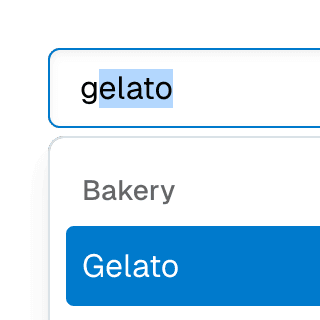
value
string | undefined
The value of the item. This will be rendered as the children by default.
If
setValueOnClickis set totrue, this will be the value of the combobox input when the user clicks on this item.If
selectValueOnClickis set totrue, this will be the value of theselectedValuestate.If the
autoCompleteprop on theComboboxcomponent is set tobothorinline, this will be the value of the combobox input when the combobox loses focus.
Live examples
preventScrollOnKeyDown
preventScrollOnKeyDownBooleanOrCallback<React.KeyboardEvent<HTMLElement>> | undefined = false
Deprecated: Use CSS
scroll-margin
instead.
Whether the scroll behavior should be prevented when pressing arrow keys on the first or the last items.