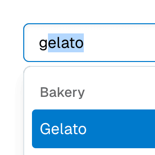
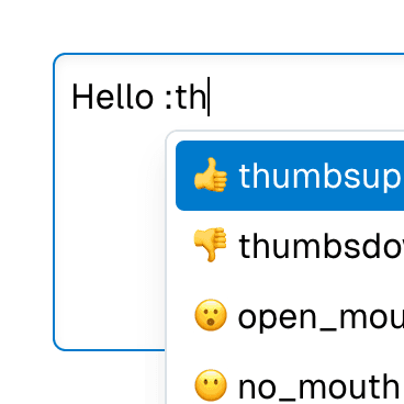
Combobox
Renders a combobox input element that can be used to filter a list of items.
Code examples
Optional Props
accessibleWhenDisabled
boolean | undefined
Indicates whether the element should be focusable even when it is
disabled.
This is important when discoverability is a concern. For example:
A toolbar in an editor contains a set of special smart paste functions that are disabled when the clipboard is empty or when the function is not applicable to the current content of the clipboard. It could be helpful to keep the disabled buttons focusable if the ability to discover their functionality is primarily via their presence on the toolbar.
Learn more on Focusability of disabled controls.
Live examples


autoComplete
StringWithValue<"list" | "none" | "inline" | "both"> | undefined = "list"
Whether the items will be filtered based on
value and
whether the input value will temporarily change based on the active item.
This prop is based on the standard
aria-autocomplete
attribute, accepting the same values:
list(default): indicates that the items will be dynamically rendered based onvalueand the input value will not change based on the active item. The filtering logic must be implemented by the consumer of this component.inline: indicates that the items are static, that is, they won't be filtered, but the input value will temporarily change based on the active item. Ariakit will automatically provide the inline autocompletion behavior.both: indicates that the items will be dynamically rendered based onvalueand the input value will temporarily change based on the active item. The filtering logic must be implemented by the consumer of this component, whereas Ariakit will automatically provide the inline autocompletion behavior.none: the items are static and the input value will not change based on the active item.
Live examples
autoFocus
boolean | undefined = false
Automatically focuses the element upon mounting, similar to the native
autoFocus prop. This addresses an issue where the element with the native
autoFocus attribute might receive focus before React effects are
executed.
The autoFocus prop can also be used with
Focusable elements within a
Dialog component, establishing the
initial focus as the dialog opens.
Note: For this prop to work, the
focusable prop must be
set to true, if it's not set by default.
Live examples
autoSelect
boolean | "always" | undefined = false
Determines if the first enabled item will be automatically focused when the
combobox input value changes. If set to true or "always", the exact
behavior hinges on the value of the
autoComplete prop:
If
autoCompleteisbothorinline, the first enabled item is automatically focused as the user types in the input. The value gets appended with the completion string if it matches. The inline completion string will be highlighted and selected.If
autoCompleteislistornone, the first enabled item is automatically focused as the user types in the input, but the input value is not appended with the item value.
If set to "always", the first enabled item is auto-highlighted when the
combobox list opens, not just when the input value changes.
To change which item gets auto-selected, use the
getAutoSelectId
prop.
Live examples
blurActiveItemOnClick
BooleanOrCallback<React.MouseEvent<HTMLElement, MouseEvent>> | undefined
Determines if the highlighted item should lose focus when the user clicks
on the combobox input element. By default, this prop's value is set
according to the
includesBaseElement
value.
composite
boolean | undefined = true
Determines if the component should act as a composite widget. This prop
needs to be set to false when merging various composite widgets where
only one should function in that manner.
If disabled, this component will stop managing focus and keyboard navigation for its items and itself. Additionally, composite ARIA attributes won't be applied. These responsibilities should be taken over by another composite component.
Note: In most cases, this prop doesn't need to be set manually. For
example, when composing Menu with
Combobox or Select with
Combobox, this prop will be
set to false automatically on the
Menu and
SelectPopover components
so the Combobox component can
take over the composite widget responsibilities.
Live examples
disabled
boolean | undefined = false
Determines if the element is disabled. This sets the aria-disabled
attribute accordingly, enabling support for all elements, including those
that don't support the native disabled attribute.
This feature can be combined with the
accessibleWhenDisabled
prop to make disabled elements still accessible via keyboard.
Note: For this prop to work, the
focusable prop must be
set to true, if it's not set by default.
Live examples
focusable
boolean | undefined
Determines if Focusable features should be active on non-native focusable elements.
Note: This prop only turns off the additional features provided by the
Focusable component.
Non-native focusable elements will lose their focusability entirely.
However, native focusable elements will retain their inherent focusability,
but without added features such as improved
autoFocus,
accessibleWhenDisabled,
onFocusVisible,
etc.
focusOnMove
boolean | undefined = true
Determines if the active composite item should receive focus (or virtual
focus if the
virtualFocus
option is enabled) when moving through items. This typically happens when
navigating through items with arrow keys, but it can also happen when
calling the
move method
directly.
Unlike the
composite prop,
this option doesn't disable the entire composite widget behavior. It only
stops this component from managing focus when navigating through items.
Note: If you want to control the behavior only when arrow keys are
pressed, use the
moveOnKeyPress
prop instead.
getAutoSelectId
((renderedItems: ComboboxStoreItem[]) => string | null | undefined) | undefined
Function that takes the currently rendered items and returns the id of the
item to be auto selected when the
autoSelect prop is
true.
By default, the first enabled item is auto selected. This function is handy
if you prefer a different item to be auto selected. Returning undefined
from this function will result in the default behavior.
Code examples
// Auto select the first enabled item with a value
const item = items.find((item) => {
if (item.disabled) return false;
if (!item.value) return false;
return true;
});
return item?.id;
}}
/>
moveOnKeyPress
BooleanOrCallback<React.KeyboardEvent<HTMLElement>> | undefined = true
Determines whether the composite widget should move focus to an item when arrow keys are pressed, given that the composite element is focused and there's no active item.
Note: To entirely disable focus moving within a composite widget, you
can use the
focusOnMove prop
instead. If you want to control the behavior only when arrow keys are
pressed, where
focusOnMove may
not be applicable, this prop must be set on composite items as well.
Code examples
onFocusVisible
BivariantCallback<(event: React.SyntheticEvent<HTMLElement, Event>) => void> | undefined
Custom event handler invoked when the element gains focus through keyboard
interaction or a key press occurs while the element is in focus. This is
the programmatic equivalent of the
data-focus-visible
attribute.
Note: For this prop to work, the
focusable prop must be
set to true, if it's not set by default.
Live examples
render
RenderProp<React.HTMLAttributes<any> & { ref?: React.Ref<any> | undefined; }> | React.ReactElement<any, string | React.JSXElementConstructor<any>> | undefined
Allows the component to be rendered as a different HTML element or React component. The value can be a React element or a function that takes in the original component props and gives back a React element with the props merged.
Check out the Composition guide for more details.
setValueOnChange
BooleanOrCallback<React.ChangeEvent<HTMLElement>> | undefined = true
Whether the combobox
value state
should be updated when the input value changes. This is useful if you want
to customize how the store
value is updated
based on the input element's value.
Live examples
setValueOnClick
BooleanOrCallback<React.MouseEvent<HTMLElement, MouseEvent>> | undefined = true
Whether the combobox
value state
should be updated when the combobox input element gets clicked. This
usually only applies when
autoComplete is
both or inline, because the input value will temporarily change based
on the active item and the store
value will not
be updated until the user confirms the selection.
showMinLength
number | undefined = 0
Specifies the minimum character count the input value should have before
the ComboboxList or
ComboboxPopover
components are displayed.
The showOnChange,
showOnClick, and
showOnKeyPress
props allow you to tailor the behavior for each unique event.
Code examples
In the following example, the combobox list will be shown when the input value has at least one character. However, if the user presses the arrow keys, the list will be shown regardless of the input value length.
showOnChange
BooleanOrCallback<React.ChangeEvent<HTMLElement>> | undefined = true
Whether the ComboboxList
or ComboboxPopover
components should be shown when the input value changes.
Live examples
Code examples
showOnClick
BooleanOrCallback<React.MouseEvent<HTMLElement, MouseEvent>> | undefined = true
Whether the ComboboxList
or ComboboxPopover
components should be shown when the input is clicked.
Live examples
Code examples
showOnKeyPress
BooleanOrCallback<React.KeyboardEvent<HTMLElement>> | undefined = true
Whether the ComboboxList
or ComboboxPopover
components should be shown when the user presses the arrow up or down keys
while focusing on the combobox input element.
Live examples
Code examples
store
ComboboxStore<ComboboxStoreSelectedValue> | undefined
Object returned by the
useComboboxStore
hook. If not provided, the closest
ComboboxProvider
component's context will be used.
showOnKeyDown
showOnKeyDownBooleanOrCallback<React.KeyboardEvent<HTMLElement>> | undefined = true
Deprecated: Use
showOnKeyPress
instead.
Whether the ComboboxList
or ComboboxPopover
components should be shown when the user presses the arrow up or down keys
while focusing on the combobox input element.
showOnMouseDown
showOnMouseDownBooleanOrCallback<React.MouseEvent<HTMLElement, MouseEvent>> | undefined = true
Deprecated: Use
showOnClick
instead.
Whether the ComboboxList
or ComboboxPopover
components should be shown when the input is clicked.