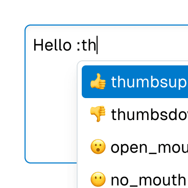
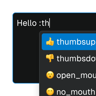
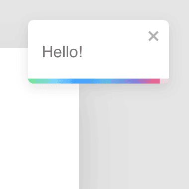
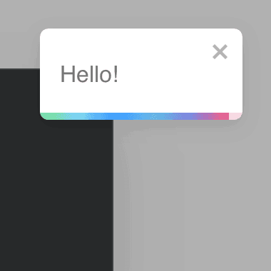
Popover
Renders a popover element that's automatically positioned relative to an anchor element.
Code examples
Optional Props
accessibleWhenDisabled
boolean | undefined
Indicates whether the element should be focusable even when it is
disabled.
This is important when discoverability is a concern. For example:
A toolbar in an editor contains a set of special smart paste functions that are disabled when the clipboard is empty or when the function is not applicable to the current content of the clipboard. It could be helpful to keep the disabled buttons focusable if the ability to discover their functionality is primarily via their presence on the toolbar.
Learn more on Focusability of disabled controls.
Live examples


alwaysVisible
boolean | undefined = false
Determines whether the content element should remain visible even when the
open state is
false. If this prop is set to true, the hidden prop and the display: none style will not be applied, unless explicitly set otherwise.
This prop is particularly useful when using third-party animation libraries such as Framer Motion or React Spring, where the element needs to be visible for exit animations to work.
Live examples
arrowPadding
number | undefined = 4
The minimum padding between the arrow and the popover corner.
autoFocus
boolean | undefined = false
Automatically focuses the element upon mounting, similar to the native
autoFocus prop. This addresses an issue where the element with the native
autoFocus attribute might receive focus before React effects are
executed.
The autoFocus prop can also be used with
Focusable elements within a
Dialog component, establishing the
initial focus as the dialog opens.
Note: For this prop to work, the
focusable prop must be
set to true, if it's not set by default.
Live examples
autoFocusOnHide
BooleanOrCallback<HTMLElement | null> | undefined = true
Determines whether an element outside of the dialog will be focused when the dialog is hidden if another element hasn't been focused in the action of hiding the dialog (for example, by clicking or tabbing into another tabbable element outside of the dialog).
By default, this is usually the disclosure element. The
finalFocus prop can be
used to define a different element to be focused.
Live examples
autoFocusOnShow
BooleanOrCallback<HTMLElement | null> | undefined = true
Determines whether an element inside the dialog will receive focus when the
dialog is shown. By default, this is usually the first tabbable element in
the dialog or the dialog itself. The
initialFocus prop
can be used to set a different element to receive focus.
Live examples
backdrop
boolean | React.ReactElement<Omit<React.DetailedHTMLProps<React.HTMLAttributes<HTMLDivElement>, HTMLDivElement>, "ref"> & { ref?: ((instance: HTMLDivElement | null) => void) | ... 2 more ... | undefined; }, string | React.JSXElementConstructor<...>> | React.ElementType<...> | undefined
Determines whether there will be a backdrop behind the dialog. On modal
dialogs, this is true by default. Besides a boolean, this prop can also
be a React component or JSX element that will be rendered as the backdrop.
Note: If a custom component is used, it must accept ref and spread all props to its underlying DOM element, the same way a native element would.
Live examples
Code examples
disabled
boolean | undefined = false
Determines if the element is disabled. This sets the aria-disabled
attribute accordingly, enabling support for all elements, including those
that don't support the native disabled attribute.
This feature can be combined with the
accessibleWhenDisabled
prop to make disabled elements still accessible via keyboard.
Note: For this prop to work, the
focusable prop must be
set to true, if it's not set by default.
Live examples
finalFocus
HTMLElement | React.RefObject<HTMLElement | null> | null | undefined
Determines the element that will receive focus once the dialog is closed, provided that no other element has been focused while the dialog was being hidden (e.g., by clicking or tabbing into another tabbable element outside of the dialog).
If
autoFocusOnHideis set tofalse, this prop will have no effect.If left unset, the element that was focused before the dialog was opened will be focused again.
fitViewport
boolean | undefined = false
Whether the popover should fit the viewport. If this is set to true, the
popover wrapper will have maxWidth and maxHeight set to the viewport
size. This will be exposed to CSS as
--popover-available-width
and
--popover-available-height.
Live examples
fixed
boolean | undefined = false
Whether the popover has position: fixed or not.
flip
string | boolean | undefined = true
Controls the behavior of the popover when it overflows the viewport:
If a
boolean, specifies whether the popover should flip to the opposite side when it overflows.If a
string, indicates the preferred fallback placements when it overflows. The placements must be spaced-delimited, e.g. "top left".
Live examples
focusable
boolean | undefined = true
Determines if Focusable features should be active on non-native focusable elements.
Note: This prop only turns off the additional features provided by the
Focusable component.
Non-native focusable elements will lose their focusability entirely.
However, native focusable elements will retain their inherent focusability,
but without added features such as improved
autoFocus,
accessibleWhenDisabled,
onFocusVisible,
etc.
getAnchorRect
((anchor: HTMLElement | null) => AnchorRect | null) | undefined
Function that returns the anchor element's DOMRect. If this is explicitly
passed, it will override the anchor getBoundingClientRect method.
Live examples
getPersistentElements
(() => Iterable<Element>) | undefined
When a dialog is open, the elements outside of it are disabled to prevent
interaction if the dialog is
modal. For non-modal
dialogs, interacting with elements outside the dialog prompts it to close.
This function allows you to return an iterable collection of elements that will be considered as part of the dialog, thus excluding them from this behavior.
Note: The elements returned by this function must exist in the DOM when the dialog opens.
Live examples
gutter
number | undefined = 0
The distance between the popover and the anchor element.
Live examples
hideOnEscape
BooleanOrCallback<KeyboardEvent | React.KeyboardEvent<Element>> | undefined = true
Determines if the dialog will hide when the user presses the Escape key.
This prop can be either a boolean or a function that accepts an event as an argument and returns a boolean. The event object represents the keydown event that initiated the hide action, which could be either a native keyboard event or a React synthetic event.
Note: When placing Ariakit dialogs inside third-party dialogs, using
event.stopPropagation() within this function will stop the event from
reaching the third-party dialog, closing only the Ariakit dialog.
hideOnInteractOutside
BooleanOrCallback<Event | React.SyntheticEvent<Element, Event>> | undefined = true
Determines if the dialog should hide when the user clicks or focuses on an element outside the dialog.
This prop can be either a boolean or a function that takes an event as an argument and returns a boolean. The event object represents the event that triggered the action, which could be a native event or a React synthetic event of various types.
Live examples
initialFocus
HTMLElement | React.RefObject<HTMLElement | null> | null | undefined
Specifies the element that will receive focus when the dialog is first
opened. It can be an HTMLElement or a React.RefObject with an
HTMLElement.
If
autoFocusOnShow
is set to false, this prop will have no effect. If left unset, the dialog
will attempt to determine the initial focus element in the following order:
- 1
- 2
The first tabbable element inside the dialog.
- 3
The first focusable element inside the dialog.
- 4
The dialog element itself.
modal
boolean | undefined = true
Determines whether the dialog is modal. Modal dialogs have distinct states and behaviors:
The
portalandpreventBodyScrollprops are set totrue. They can still be manually set tofalse.When using the
HeadingorDialogHeadingcomponents within the dialog, their level will be reset so they start withh1.A visually hidden dismiss button will be rendered if the
DialogDismisscomponent hasn't been used. This allows screen reader users to close the dialog.When the dialog is open, element tree outside it will be inert.
Live examples
onClose
((event: Event) => void) | undefined
This is an event handler prop triggered when the dialog's close event is
dispatched. The close event is similar to the native dialog
close
event. The only difference is that this event can be canceled with
event.preventDefault(), which will prevent the dialog from hiding.
It's important to note that this event only fires when the dialog store's
open state is set
to false. If the controlled
open prop value changes, or
if the dialog's visibility is altered in any other way (such as unmounting
the dialog without adjusting the open state), this event won't be
triggered.
Live examples
onFocusVisible
BivariantCallback<(event: React.SyntheticEvent<HTMLElement, Event>) => void> | undefined
Custom event handler invoked when the element gains focus through keyboard
interaction or a key press occurs while the element is in focus. This is
the programmatic equivalent of the
data-focus-visible
attribute.
Note: For this prop to work, the
focusable prop must be
set to true, if it's not set by default.
Live examples
open
boolean | undefined
Controls the open state of the dialog. This is similar to the
open
attribute on native dialog elements.
Live examples
overflowPadding
number | undefined = 8
The minimum padding between the popover and the viewport edge. This will be
exposed to CSS as
--popover-overflow-padding.
Live examples
overlap
boolean | undefined = false
Whether the popover can overlap the anchor element when it overflows.
Live examples
portal
boolean | undefined = true
Determines whether the element should be rendered as a React Portal.
Live examples
portalElement
HTMLElement | ((element: HTMLElement) => HTMLElement | null) | null | undefined
An HTML element or a memoized callback function that returns an HTML
element to be used as the portal element. By default, the portal element
will be a div element appended to the document.body.
Live examples
Code examples
const [portal, setPortal] = useState(null);
<div ref={setPortal} />
const getPortalElement = useCallback(() => {
const div = document.createElement("div");
const portalRoot = document.getElementById("portal-root");
portalRoot.appendChild(div);
return div;
}, []);
portalRef
React.RefCallback<HTMLElement> | React.MutableRefObject<HTMLElement | null> | undefined
portalRef is similar to ref but is scoped to the portal node. It's
useful when you need to be informed when the portal element is appended to
the DOM or removed from the DOM.
Live examples
Code examples
preserveTabOrder
boolean | undefined = false
When enabled, preserveTabOrder will keep the DOM element's tab order the
same as the order in which the underlying
Portal component was mounted in
the React tree.
If the
preserveTabOrderAnchor
prop is provided, the tab order will be preserved relative to that element.
preserveTabOrderAnchor
Element | null | undefined
An anchor element for maintaining the tab order when
preserveTabOrder
prop is enabled. The tab order will be kept relative to this element.
By default, the tab order is kept relative to the original location in the
React tree where the underlying
Portal component was mounted.
Code examples
const [anchor, setAnchor] = useState(null);
<button ref={setAnchor}>Order 0</button>
<button>Order 2</button>
// Rendered at the end of the document.
<button>Order 5</button>
// Rendered at the end of the document, but the tab order is preserved.
<button>Order 3</button>
// Rendered at the end of the document, but the tab order is preserved
// relative to the anchor element.
<button>Order 1</button>
<button>Order 4</button>
preventBodyScroll
boolean | undefined
Determines whether the body scrolling will be prevented when the dialog is
shown. This is automatically set to true when the dialog is
modal. You can disable this
prop if you want to implement your own logic.
render
RenderProp<React.HTMLAttributes<any> & { ref?: React.Ref<any> | undefined; }> | React.ReactElement<any, string | React.JSXElementConstructor<any>> | undefined
Allows the component to be rendered as a different HTML element or React component. The value can be a React element or a function that takes in the original component props and gives back a React element with the props merged.
Check out the Composition guide for more details.
sameWidth
boolean | undefined = false
Whether the popover should have the same width as the anchor element. This
will be exposed to CSS as
--popover-anchor-width.
shift
number | undefined = 0
The skidding of the popover along the anchor element. Can be set to negative values to make the popover shift to the opposite side.
Live examples
slide
boolean | undefined = true
Whether the popover should slide when it overflows.
store
PopoverStore | undefined
Object returned by the
usePopoverStore hook.
If not provided, the closest
PopoverProvider
component's context will be used.
unmountOnHide
boolean | undefined = false
When set to true, the content element will be unmounted and removed from
the DOM when it's hidden.
Live examples
updatePosition
((props: { updatePosition: () => Promise<void>; }) => void | Promise<void>) | undefined
A callback that will be called when the popover needs to calculate its
position. This will override the internal updatePosition function. The
original updatePosition function will be passed as an argument, so it can
be called inside the callback to apply the default behavior.
Live examples
wrapperProps
React.HTMLAttributes<HTMLDivElement> | undefined
Props that will be passed to the popover wrapper element. This element will be used to position the popover.