All things Button
Components
Examples
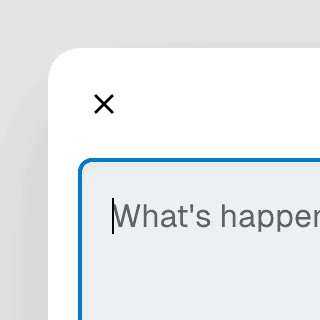
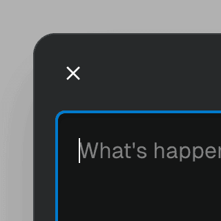
Animated DialogAnimating a modal Dialog and its backdrop element using CSS. The component waits for the transition to finish before completely hiding the dialog or removing it from the React tree.
Dialog with scrollable backdropRendering a modal Dialog component inside a scrollable backdrop container for dialogs that are
taller than the viewport.
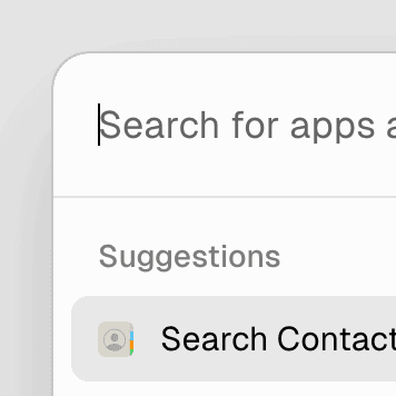
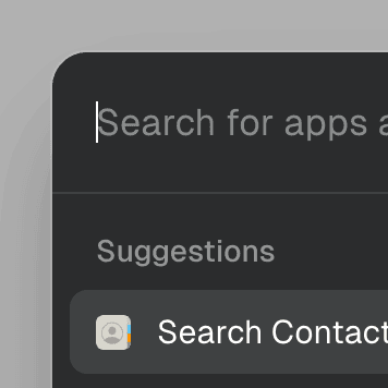
Command MenuCombining Dialog and Combobox to enable users to search a command list in a Raycast-style modal.


Command Menu with TabsCombining Dialog, Tab, and Combobox from Ariakit React to build a command palette component.
Dialog with details & summaryCombining Dialog with the native details element in React so users can interact with it before JavaScript finishes loading.
Dialog with Framer MotionUsing Framer Motion to add initial and exit animations to a modal Dialog and its backdrop element.
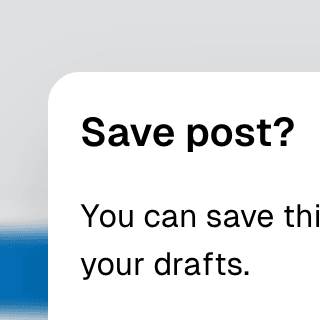
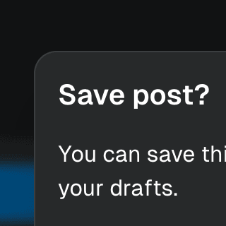
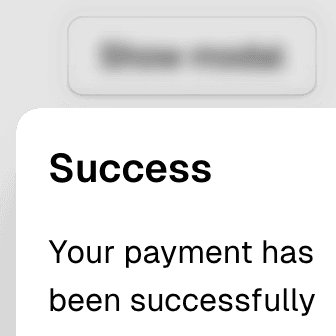
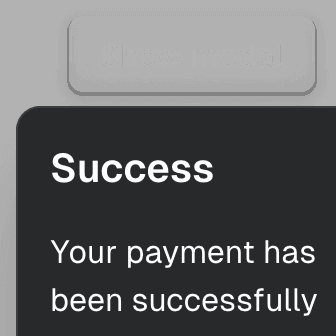
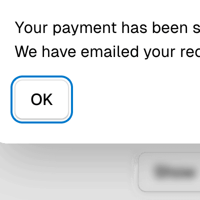
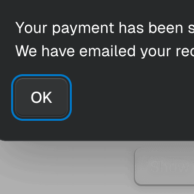
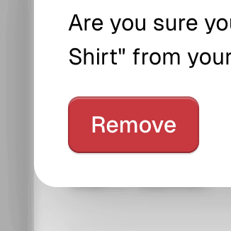
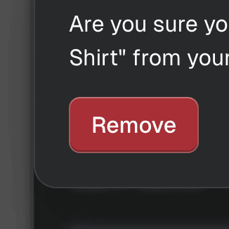
Warning on Dialog hidePreventing users from accidentally closing a modal Dialog component with unsaved changes by displaying a nested confirmation dialog.
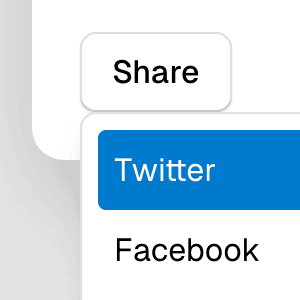
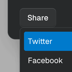
Dialog with MenuShowing a nested dropdown Menu component inside a modal Dialog using React.
Nested DialogRendering a modal Dialog to confirm an action inside another modal dialog using React.
Dialog with React RouterUsing React Router to create a modal Dialog that's controlled by the browser history.
Dialog with React-ToastifyShowing notification toasts using libraries like react-toastify and react-hot-toast while keeping a modal Dialog open with the getPersistentElements prop.