CompositeHover
Renders an element in a composite widget that receives focus on mouse move and loses focus to the composite base element on mouse leave.
This should be combined with the
CompositeItem component.
The
focusOnHover
and
blurOnHoverEnd
props can be used to customize the behavior.
Code examples
Item
Optional Props
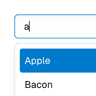
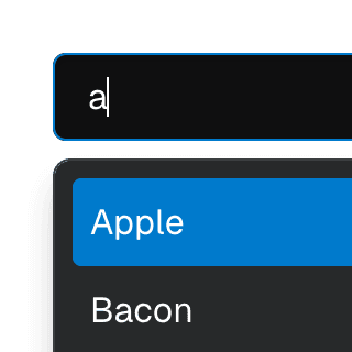
blurOnHoverEnd
BooleanOrCallback<React.MouseEvent<HTMLElement, MouseEvent>> | undefined
Determines if the composite item should lose focus when the mouse leaves.
By default, this is set to true if
focusOnHover
is true.
Live examples




focusOnHover
BooleanOrCallback<React.MouseEvent<HTMLElement, MouseEvent>> | undefined = true
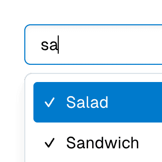
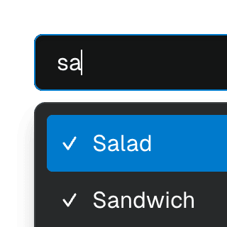
Determines if the composite item should be focused when hovered over.
Note that the actual DOM focus will stay on the composite element. This
item will get the
data-active-item
attribute so it can be styled as if it's focused.
Live examples




render
RenderProp<React.HTMLAttributes<any> & { ref?: React.Ref<any> | undefined; }> | React.ReactElement<any, string | React.JSXElementConstructor<any>> | undefined
Allows the component to be rendered as a different HTML element or React component. The value can be a React element or a function that takes in the original component props and gives back a React element with the props merged.
Check out the Composition guide for more details.
store
CompositeStore<CompositeStoreItem> | undefined
Object returned by the
useCompositeStore
hook. If not provided, the closest
Composite or
CompositeProvider
components' context will be used.