All things Menu
Components
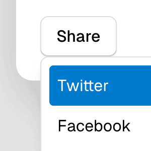
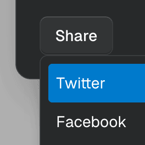
MenuAccess a set of commands within a dropdown menu. This component is based on the WAI-ARIA Menu Pattern and the WAI-ARIA Menu Button Pattern.
MenubarRender a visually persistent menu similar to those found near the top of the window in desktop apps. This component is based on the WAI-ARIA Menubar Pattern.
Examples
Dialog with MenuShowing a nested dropdown Menu component inside a modal Dialog using React.
Menu with ComboboxCombining Menu and Combobox to create a dropdown menu with a search field that can be used to filter menu items.
Context menuShowing Menu when right-clicking on an element using the getAnchorRect prop to determine the position of the popover.
Menu with Framer MotionAbstracting Menu into a reusable dropdown menu component that uses Framer Motion to create smooth initial and exit animations.
MenuItemCheckboxRendering a dropdown Menu using the MenuItemCheckbox component with the values and setValues props from MenuProvider to control the checked items.
MenuItemRadioRendering Menu using MenuItemRadio as children and the values prop from MenuProvider to control the checked item.
SubmenuRendering nested Menu components to create a dropdown menu with submenus that open when hovering over the parent menu item.

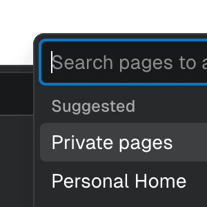
Submenu with ComboboxNesting Notion-style dropdown menus with search & autocomplete features by combining Menu with Combobox.
Sliding MenuRendering nested Menu components to create submenus that slide in and out using CSS Scroll Snap.
Menu with TooltipRendering Menu with a Tooltip that appears when hovering over the MenuButton component by combining it with the TooltipAnchor component.
Navigation MenubarUsing Menubar, Menu, and Portal to create an accessible, tabbable navigation menu widget with links and menu buttons that expand on hover and focus.
API Reference
useMenuStoreCreates a menu store to control the state of
Menu components.
useMenuContextReturns the menu store from the nearest menu container.
useMenuBarContextDeprecated:
Use useMenubarContext
instead.
useMenuBarStoreDeprecated:
Use useMenubarStore
instead.
MenuRenders a dropdown menu element that's controlled by a
MenuButton component.
MenuArrowRenders an arrow element inside a
Menu component that points to its
MenuButton.
MenuBarDeprecated:
Use Menubar instead.
MenuBarProviderDeprecated:
Use MenubarProvider
instead.
MenuButtonRenders a menu button that toggles the visibility of a
Menu component when clicked or when
using arrow keys.
MenuButtonArrowDisplays an arrow within a
MenuButton, pointing to the
Menu position. It's typically based
on the placement
state from the menu store, but this can be overridden with the
placement
prop.
MenuDescriptionRenders a description in a menu. This component must be wrapped with a
Menu component so the
aria-describedby prop is properly set on the menu element.
MenuDismissRenders a button that hides a Menu
when clicked.
MenuGroupRenders a group for MenuItem
elements. Optionally, a
MenuGroupLabel can be
rendered as a child to provide a label for the group.
MenuGroupLabelRenders a label in a menu group. This component should be wrapped with
MenuGroup so the
aria-labelledby is correctly set on the group element.
MenuHeadingRenders a heading in a menu. This component must be wrapped within
Menu so the aria-labelledby prop is
properly set on the content element.
MenuItemRenders a menu item inside
MenuList or
Menu
components.
MenuItemCheckRenders a checkmark icon when the
checked prop is
true. The icon can be overridden by providing a different one as children.
MenuItemCheckboxRenders a menuitemcheckbox
element within a Menu component. The
name prop must be
provided to identify the field in the
values state.
MenuItemRadioRenders a menuitemradio
element within a Menu component. The
name prop must be
provided to identify the field in the
values state.
MenuListRenders a menu list element. This is the primitive component used by the
Menu component.
MenuProviderProvides a menu store to Menu
components.
MenuSeparatorRenders a divider between
MenuItem,
MenuItemCheckbox, and
MenuItemRadio elements.