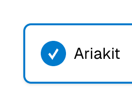
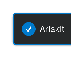
Checkbox
Select one or more options in a list or toggle a single option using a native or custom checkbox in React. This component is based on the WAI-ARIA Checkbox Pattern.
Examples


API
Styling
For more information on styling with Ariakit, refer to the Styling guide.
Styling the checked state
For consistency, the aria-checked attribute is always rendered on Checkbox, even when it's a native checkbox element. This means you can style the checked state using the aria-checked attribute selector:
.checkbox[aria-checked="true"] {
background-color: hsl(204 100% 40%);
color: hsl(204 20% 100%);
}
Styling the disabled state
When the accessibleWhenDisabled prop is true, the checkbox element won't have the disabled attribute. This is so users can still focus on the checkbox while it's disabled. Because of this, you should use aria-disabled to style the disabled state:
.checkbox[aria-disabled="true"] {
opacity: 0.5;
}